Flooring The Consumer on Simple Marketing Now

Please visit Flooring The Consumer's new home on SimpleMarketingNow.com where you can subscribe to receive updates to blog articles in real time!

Saturday, April 28, 2007

I Have Met The Mouse!

His name is Mickey. Mickey Mouse. And signs of him appear everywhere IF you know how to look.

I'm just back from a full day in Orlando, courtesy of Maritz, that included a half day session with the Disney Institute -- the whole day chock full of fabulous learnings...

This is the most intimate view of the Disney empire I've ever experienced. I visited Disney World once, as a 10 or so year old, a few years after the resort opened.

Honestly, I don't remember a whole lot. We waited in lines, did a few rides, including a planetarium exhibit that I thought was at Epcot. However, according to the Wikipedia Disney World entry, Epcot didn't open until 1982. I'm relieved as there is no way that we could logically have made it from the Magic Kingdom to Epcot in one day....

To be fair, the early 70s were a very different time: Disney played an important role in my life as it and Mutual of Omaha's Wild Kingdom with Marlin Perkins were the last two TV programs I watched on Sunday evening before going to bed. And, then, no more TV until Friday after school came around.

Today, everywhere we turn we encounter some form of Disney entertainment....

Thanks to Disney, storytelling and make-believe have taken on new dimensions. Not just for kids, but increasingly for adults, and for the kid in all of us! Returning to Disney as an inquisitive adult certainly suggested that there would be potential to this visit. I have gained far more!

Case in point: the Mouse. Do you realize that the Mouse is EVERYWHERE? [Check out the unofficial Mickey Mouse site.]

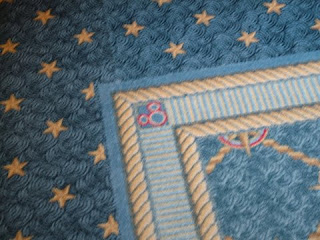
This picture captures the hallway carpet from my hotel - the Disney's Yacht Club Resort. Notice someone in the corner?

The elevator showcased restaurant recommendations: Mickey appeared as a waffle, a pancake, and probably a sandwich. I looked for him in the steak...

My room wound up being a treasure trove of sightings. Take this framed yacht race image. See anything on the buoy?

Mickey appeared on the cushions in my room amidst various maritime flag patterns.

Now, check out the bedspread.... pretty subtle!

The bathroom was a natural place for sightings: coasters, welcome card... Unfortunately, the soap with Mickey sketched into it didn't photograph too well. But, you can imagine the effect - not to mention the shampoo, conditioner and lotion bottle artwork.

That Mickey motif from the bedspread was repeated in the mirror 'topper'. I never until now appreciated how versatile a design element the Mouse could be.

I started doubting my critical and observational abilities. Notice the wall paper pattern. Might a Mouse be captured therein? Hmmmm.

The power of these details is amazing: they engaged me even before hearing about how Disney creates its magic. They not only captured my imagination, but they brought Mickey to life. They suggested that, if so much attention could be paid to seemingly small insignificant details, then the bigger and more important details would certainly be taken care of. They ensured that the Mickey Mouse brand was rock solid in my mind.

Here, you see Mickey adorning the bus that took us to The Magic Kingdom for our field observations.

Translating Mickey to the retail experience, think about what all of your details communicate about your brand, your store and your experience. Those details absolutely matter to your business and to the impression that your consumers -particularly your women consumers- form about your business.

Look, then, at your experience with a new set of eyes. Look for the Mouse....

And, for the record, there is only ONE Mickey Mouse!

Technorati Tags: , , , ,

Monday, April 23, 2007

How Do You Define Customer Experience?

Sign in an East Village liquor store originally uploaded by Broolyn Hilary.

Creating a delightful or amazing customer experience matters to us and to our businesses, right? After all, the quality of our customer experience can make or break our success.

But, what do we actually mean when we refer to 'customer experience'?

Stephanie Weaver from Experienceology asks that question, and wraps up a multi-part series with Customer experience definitions: The finale in which the following bloggers offer their perspectives:

Susan Abbott: Customer Experience Crossroads
Adam Lawrence: Work*Play*Experience
Helene Blowers: Library Bytes
Mark Hurst: Good Experience
Sara Cantor: The Curious Shopper
Pamela Slim: Escape from Cubicle Nation
Becky Carroll: Customers Rock!
Marianna Hayes: Results Revolution

Here is my interpretation as captured in Defining customer experience Part 5:

I like to use the image of 'walking in her shoes' to capture the notion of customer experience, because it's all about suspending all of an organization's pre-conceived notions about the customer and truly appreciating or understanding the experience from her perspective.

That would include listening, hearing, seeing, feeling, doing [i.e. asking,searching, buying...] as the consumer would. It would definitely include
removing the irritants.

This holds for on-line as well as off-line, and before the purchase, during the purchase and definitely after the purchase, with the goal being to make the experience so hassle-free that it leads to a multitude of further experiences [i.e. a relationship].

The folks at
Future Now do a great job in their books Waiting for Your Cat to Bark? and Call to Action explaining the conflict between a consumer's purchase process and a buyer's selling process. Their focus is more on websites, but holds equally for an offline experience.

Too often, as business-people we think only of the selling process when we should be thinking about our consumer's purchasing process. Our challenge is to intuitively match up our selling process with how the consumer approaches it and delight them with the ease of our processes. Because we have thought through so carefully what matters to them, we create a wonderful customer experience.

Stephanie also offers a podcast interview with Susan Abbott about the art and science of creating great customer experiences. Some highlights:

Authenticity of communication -as in a blog- is paramount for a succcessful customer experience. Increasingly, customers seek out a truthful, believable, honest voice in deciding who they will do business with. [Reminds me of elements from the Trader Joe's value guide in Trader Joe's: Where Values Drive The Brand.]

Although Abbott appreciates IKEA's integrated branded experience, Weaver objects to the poor wayfinding that the retailer promotes. It's critical to understand consumer's irritants and then address them systematically [Susan ever refers to "walking in customers' shoes" to identify irritants. Brilliant image, Susan!]. The process never ends and eternal vigilance is what sets organizations like the Ritz-Carlton apart.

Abbott - a qualitative researcher specializing in customer experience - touches on several tools of her trade and how those have expanded via the internet: discussion forums or bulletin boards for 1/2 hour over 3 days where people come/go, responding to questions in writing with thoughtful, thorough feedback, shop-a-longs, or even standing/watching [i.e., think retail anthropologists].

Her rule of thumb for research projects is that one should obtain 10x the value as what one puts into the project. For example, if you plan to invest $5,000 into a new display system, you should plan on spending $500 researching that you have the right concept to begin with.

Do listen for yourselves for interesting examples and ideas relating to delivering great customers experiences.

And, if you define customer experience differently, do share!


Technorati Tags: , , , , ,

Saturday, April 21, 2007

If This Floors, Please Vote For!

My site was nominated for Best Marketing Blog! I am so excited!

Flooring the Consumer has been nominated in the Blogger's Choice Awards in FOUR categories!

  • Best Marketing Blog
  • Best Business Blog
  • Best Shopping Blog
  • Best Blog Design
How cool is that? Thank you, Chris Abraham!

If you, too, consider it cool and feel that Flooring The Consumer floors, then please click on one or all of these 'badges' and cast your own vote. Maybe together we can make blogging history!

My site was nominated for Best Business Blog! My site was nominated for Best Shopping Blog! My site was nominated for Best Blog Design!

Another wonderful blogger whose site has been nominated is Sara Cantor's The Curious Shopper. You can vote for her via her post Curious Shopper For President

As the folks at Bartles & Jaymes used to say, "Thank You for Your Support!"

Technorati Tags: , ,

Tuesday, April 17, 2007

Trader Joe's - Where Values Drive The Brand

Imagine standing in a proper, Midtown Manhattan meeting space [i.e., the Penn Club], and seeing several guys walking around in Hawaiian shirts. Strange - until you realize that you're about to spend An Evening with Dan Bane, Chairman and CEO of Trader Joe's [sponsored by The London Business School Club of New York] - at which point it seems not only normal, but appropriate!

Are you familiar with Trader Joe's, the quirky, neighborhood grocery chain considered second in the nation after Wegman's? [per 10/06 Consumer Reports Supermarket ranking - registration required]. I am. I'm not only passionate about the store, but also really curious about the magic that Trader Joe's consistently creates.

After hearing Dan Bane talk about Trader Joe's, I understand a little better the magic that this strong, carefully and consistently nurtured brand creates.

Brief story of Trader Joe's:
[Refer, too, to the Wikipedia article on Trader Joe's for the more detailed version.] Joe Coulombe started Pronto Market in Pasadena, CA in 1958 around the notion of convenience. He was a classic entrepreneur and sold the company in 1979 to the Albrecht family - owners of the German grocery chain Aldi. Joe stayed on for 10 years, when John Shields took over.

Shields came from Macy's and instituted 3 brilliant changes: 1. he decentralized operations; 2. he developed training programs [including management classes on how to deal with people, and how to speak the same language]; 3. he brought professional buying experience to the organization.

Trader Joe's remains privately held. The Albrecht family has never taken any money out of the organization, nor put any back in. Their guidelines: grow the company as fast as you, without borrowing money. They review/approve leases over a certain level. They expect quarterly financials. On a yearly basis, they spend 3.5 days visiting stores. They are true retailers and want to share ideas and concepts.

Bane, an accountant by training, joined the company in 2001. This article from the USC News from 2/22/07 titled He's Got It in the Bag by Evelyn Jacobson gives a feel for Bane's style as well as for Trader Joe's.

Company financial overview: in 1998, after 40 years, Trader Joe's generated $1B in total sales. In 2006, this increased to $5.4B with 278 stores [175 west/103 east] and a tight product assortment of 3200 skus [vs. 60k normal supermarket]. Eastern region extends from Boston - opened 10 years ago - to Chicago, and recently to Atlanta. The NYC, opened 1 year ago, already generates the highest volume [Trader Joe's would like to have 5 NYC stores].

Stores target high density, high income, high education areas with the goal of 'bringing civilization' via primarily specialty foods.

The Values of Trader Joe's:
Bane described the 'values guide' that makes Trader Joe's what it is. It identifies what matters and what everyone in the organization relentlessly pursues, lives by, and makes decisions according to. It's serious stuff!

1. Integrity. This goes beyond accepting any gifts or free tickets [Freebies must go through an auction process for company-wide reallocation. Any proceeds go to charity.]. It's about simply treating people as you would want to be treated and always acting as if your customer were looking over your shoulder.

2. Product driven company [vs. vendor driven]. Trader Joe's actively seeks out great products and suppliers. It is purposely 80% private label, avoids middlemen, preferring to deal directly with manufacturers and growing with them. The company would rather obtain a low price for a product than receive promotional dollars.

Although it advertises via radio, its flyer/circular -- which beautifully captures the quirky, adventure-loving and humorous quality that Trader Joe's stores express -- is its primary vehicle. These are Trader Joe's produced/created pieces. The other marketing focus consists of in-store tastings or demonstrations. It's the largest marketing expense and brings not only the products to life, but also the story-telling and entertainment qualities that you'll read more about below.

Definitely, treat suppliers fairly and with respect - work as partners; pay bills - in contrast to the traditional relationship which is about traditional buying, waiting for others, brand name focus, buying through distributors, lots of promo $$ [slotting, promo and demonstration fees, culminating in an adversarial relationship with suppliers].

As a product driven company, Trader Joe's expends a great deal of energy around product development. Buyers are passionate about their category. Not surprisingly, 2 are former chefs. They search the world for the unusual, the unexpected, the delicious and the memorable. They are hip and definitely recognize trends. They live up to their description as 'traders on the culinary seas'.

In fact, tasting panels to test new products take place twice a day in Boston or Monrovia. Just listen for the ringing of the maritime bell! During these sessions, participants [buyers, regional managers, executives...] discuss the taste, the pricing, whether it's worth the store space? whether it's private label-able? whether the product is necessary? is the supplier dependable? And, is there a good STORY to tell about the product? All very serious business!

[Check out the Trader Joe's website Products page and you'll get a better taste for their seriousness.]

To illustrate the success of their product focus, realize that Trader Joe's sold 9,644,544 tortillas last year, and 13m cases of Charles Shaw wine [i.e., 2 buck chuck] at $1.99 on West Coast/$2.00 in NYC [the equivalent of here and back to the moon twice if you placed the bottles end to end; the best selling item for the past 5 years].

Dan Bane referred to The Myth of Excellence: Why Great Companies Never Try to Be the Best at Everything which suggests that no business should excel at all five business categories [product, price, accessibility, service, experience]. Instead, a business should be world class at one, be great at another and then meet customer expectations on the rest. So, for example, Trader Joe's is world class on product, great at experience, and meets customer expectations on service, accessibility and price [vs. Wal-Mart which is price driven, then product focused, and meets expectations on service, experience and accessibility].

3. Create a WOW customer experience. Retailing is all about creating a Wow experience. This consists of two aspects: the internal/how do you make me feel? do you care I'm there? do you care I'm safe? do you respect me? do you trust me? and the external which includes signs [local artists create the in-store artwork and make each store great, individual, distinct and connected to its neighborhood], product demonstrations [the right person makes it fun] and entertainment [e.g., the flower displays, having store crew members dress up as Cookie Monster]. When it all clicks, the end result is a WOW experience for the customer!

4. No bureaucracy. This is a lean, flat, simple, focused organization. Corporate headquarters consists of cubicles - even for Dan Bane! - and no secretaries. The focus is on connecting with customers and supporting the stores. Bane visits each store 3 to 4 times per year. And, when he visits the stores, he becomes "Bagger First Class", greets customers, helps them carry groceries or listens to them talk about their likes and dislikes.

5. National chain of neighborhood stores. Trader Joe's stores maintain a tight connection with their communities. Continuing with the nautical/South Seas imagery, a captain runs each store, and ensures that all customers truly feel that they have an inalienable right to shop there.

6. Kaizen. Everyone has a duty to do better. Although the organization does no budgeting [amazing!], it constantly challenges itself on how to improve over the previous year - sales? managerial profit percentages? sales per crewmember %? The focus is completely on improving the performance at Trader Joe's - rather than worrying about what competitors are doing.

7. The store is the brand. Look at the Trader Joe's website and appreciate how consistently the stories get told. Examine the flyer which captures the mystique of these traders on the culinary seas. Look at the Hawaiian shirts. Read the product descriptions. Every element, every story, every detail reinforces the Trader Joe's brand and leads the consumer directly into the Trader Joe's store. Captured here are some ferocious emotional and personal consumer responses, forged by strong connections to the stores. These truly are neighborhood stores. Their stores. In fact, this 2/14/06 Business Week article, My Valentine to Trader Joe by Amy Dunkin, represents one customer's ode to the store.

The 'values guide' codifies the process so that the company makes consistently focused decisions. For example, the guide meant saying no to purchasing a store chain in Texas. Internet sales make no sense even though they represent easy money. Same goes for product sales in Japan. Just wrong. However, the guide will support nationalizing what makes sense to be nationalized [bananas, olive oil] to support growth, and localizing other products [e.g., bakery].

Sources of Inspiration:
Bane mentioned that he and his crew had dined at several of the Danny Meyer restaurants given their reputation for hospitality [per his book Setting the Table: The Transforming Power of Hospitality in Business]. They learned a great deal about the customer experience - including that all it takes is one person to blow it!

He routinely goes to department stores for ideas.

He has stolen ideas from Disney [i.e., the hand done signs and music that changes every 20 feet within Disney theme parks - that's why each store has its own theme]. [This reminded me of Drew McLellan's Magic of Disney series with Marketing Lessons from Walt].

Miscellaneous
Trader Joe's wants to be the first and favorite grocery stop. Banes loves to be located next to Costco or Whole Foods.

Supermarkets were trying to out Wal-Mart Wal-Mart and they forgot about the customer in the process. Now, they are trying to differentiate themselves and doing more private label to be unique.

Trader Joe's has world record fast turns in store, but -purposely- slow warehouse turns. They focus on having the right products that sell in-store. Although they manage their warehouses, they contract out the actual warehouse and trucks. Their goal is have every product available to every store, every day.

The product line is very carefully managed. Nothing can be introduced without removing a lesser performing product. Buyers monitor weekly sales thresholds per product. If the product doesn't hit the target, the buyer checks to see that everything possible to promote the product has been done. If they have, then they eliminate it. It's a rigorous score keeping process.

Trader Joe's: The Trendy American Cousin in the 4/26/2004 issue of Business Week by Larry Armstrong provides you with a nice perspective on the Trader Joe's magic, a place where values truly drive the brand.

Technorati Tags: , , , ,

Friday, April 13, 2007

Southlake Town Square - A Lifestyle Center

I'm a city girl at heart -- which is why I'm so intrigued with Lifestyle Centers and on a quest to experience more of them.

Malls serve a purpose, but the buzz you get from city stores make them pale in comparison. Others must feel similarly, otherwise we wouldn't be seeing Lifestyle Centers - an evolution in the retail experience, a step beyond the traditional enclosed mall retail concept, and an attempt at recapturing urban magic - generating so much interest and attention.

I located my latest Lifestyle Center on the outskirts of Dallas, TX, in a place called Southlake Town Square.

[Previous postings on Lifestyle Centers include Atlanta's Atlantic Station - A Lifestyle Center, and, with Scott Moore's expert perspective, An Architect's View of Better Lifestyle Centers.]

Southlake Town Square is this development's official website. On the map above, the main highway appears at the top of the image, parallel to these words. Across that highway [and not part of the development] is a more traditional strip mall with fancy grocery store and other amenities. Some of the photos below I took from that vantage point.

The development occupies 130 acres and intermingles shopping, eating, working and living in a very attractive layout organized around local county government and public spaces. This large formal building on the right is the Town Hall and provides not only a destination, but also a sense of place.

It opened in March 1999 and currently includes 10 city blocks over 54 acres, with a next phase of development underway that brings movie theaters, a Hilton hotel, additional retailers and more townhouses.

According to Great Public Spaces, which includes Southlake Town Square [site includes some nice photos and details], the development "demonstrates the successful application of key smart growth principles including a mix of land uses, compact building design, creation of a walkable environment with a distinct sense of place, and involving citizen and stakeholder participation in development decisions".

Furthermore, "the project's historic downtown grid pattern embodies the traditions of a Texas courthouse downtown. An interconnected network of streets, short blocks, and buildings at the sidewalk all create a compact, pedestrian-scaled public realm."

The inclusion of municipal/civic buildings [rather than department stores] [e.g., post office, library and courthouse] as anchors significantly affected my perception of Southlake Town Square. [This Jan/Feb 2006 article from The NAWIC Image titled Shop 'til you Drop specifically references Southlake Town Center and how it has "brought the town square back to life."]

Yes, it's new. Yes, it's planned. But, it doesn't feel as unnatural as Atlantic Station felt. Although it's chock full of retail options [check out the retail guide] including some surprises like Coldwater Creek - The Spa!, the stores look better distributed around the complex [retail in map above is dark brown]. Parking also seemed less sparse, with more diagonal spots vs. parallel parking spots only at Atlantic Station.

An observation: when I motor through the suburbs, I depend on signage to signal specific retail establishments. This is not the case here where I spotted no overt retailer signs. The website carries information. The brochure I had details most of the website information. Other than via those two tools [which don't really work when you're driving], it's difficult to appreciate all of the options available without walking by or driving through every street. For example, there is a Container Store. Unless I know to turn onto North Carroll Avenue [on the right hand side above], I would never chance upon it.

Not a big deal. Simply a paradigm shift in suburban shopping patterns. Especially when compared to strip malls which have become more popular as we've become more time stressed. They allow us to efficiently get in/out of specific stores. They can be spotted from a distance. They tend not to be about lingering.

Lifestyle Centers, in contrast, pull us back into another zone, where time pressures are suspended; the best experience truly is on foot, and ideally you're from the neighborhood, and return frequently.

Now, as with Atlantic Station and IKEA, Southlake Town Square does accommodate destination stores [e.g., The Container Store] with dedicated parking, but in a more integrated manner. Streets are similarly narrow with many one way streets. Traffic jams will absolutely happen while people are pulling in/out of parking spaces. However, retail spaces seem spread out over a larger area, and congestion possibly less intense.

Other observations: the variety of architectural elements is fun as you can see from the corner turret in the photo above. The public spaces truly engage, with wonderful painted cows strewn about.... The last time I saw such fun cows was in Denver [see Mooving On To Greatness] last August.

In its write-ups, Southlake Town Square makes a big deal about its traditions which contribute to creating a sense of place and community:
+ Art in the Square at the end of April
+ July 3rd Independance Day Fireworks Show
+ Oktoberfest in early October
+ Mid-November through December: Home for the Holidays

This article from the August 2006 issue of Urban Land titled The life in lifestyle centers. What are the ingredients for a successful lifestyle center? by Jeff Gunning examines 4 projects to better understand characteristics and success factors:

+ Kierland Commons, Scottsdale, AZ;
+ The Grove, in Hollywood, CA;
+ Legacy Town Center, Plano, TX [I wish I had known about that one while in Dallas!];
+ The Market Common, in Clarendon, VA [note to self: visit on next DC trip].

From the article:
- All four "capture the vitality of a traditional main street through some replication of organic growth, urban density and a mix of uses."
- They "position shopping as less of a destination-focused errand and as more of a leisure activity."
- "The integration of residential space appears to be a component more likely to make or break a project."
--> creates buzz and sense of security.
- "Most important... is a design that maximizes accessibility. Accessibility focuses on creating connections .... and seamless access to businesses."
- "A lifestyle center depends on a balanced choreography of its users and the individual creative identities of its tenants to shape its image and atmosphere."
- "The sense of place created by a lifestyle center.. offers its own distinct ... flavor. The layout of a lifestyle center is often focused inward, enclosing a hub of activity that appears to have little visible relation to the surrounding architectural context."
- Building heights and street widths "shape a simple, human-scaled atmosphere where tenants function as individual building blocks..."
- "Landscaping as a unifying element."


And, a fascinating observation: "..on one level, the streamlined architecture of all four projects seems to function as the brick-and-mortar answer to online shopping, a technological innovation that has contributed to the decline of the traditional mall. In a lifestyle center, visitors are not required to pass through layers of thematic elements before they can connect with retailers and brands - further removing barriers between customers and the products they desire." I hadn't thought of it that way.

This 2003 article by Charles C. Bohl titled The Second Coming of the American Town Center examines the evolution of the town center starting in the 1980s, the drivers [demographics, retail innovations, public policies] and the benefits. It mentions and how well town center stores perform. In addition to record opening-day sales at several Southlake Town Square national retailers, it has "provided a once centerless suburban community with a home for its City Hall, government offices and post office, and quickly become a popular setting for community events. Over 6,000 residents turned out for the first Fourth of July celebration and over 20,000 for the second; and an estimated 25,000 people attended a weekend Art in the Square festival the first year, and with 40,000 the following year."

Note in the conclusion: "...Nothing can substitute for good site location, a sound market analysis, and a carefully designed tenant mix and leasing strategies, but town centers have an additional dimension that boils down to 'Walt Disney World 101.' After decades of painstaking surveys and analysis, Disney's management team discovered that it was not the 'attractions' that were fueling the repeat business that is absolutely essential to the economic success of the company's theme parts -- it was the overall quality of the built environment and the pleasure people receive from strolling, sitting and enjoying the place itself. The same is true for town centers and main streets."

Finally, this presentation includes references to a multitude of other Lifestyle Centers around the country. If you've experienced any of these, please do share your impressions. I'm intrigued with the possibilities that Lifestyle Centers [or the next evolution] hold for us as consumers, as marketers, as retailers in general, and as flooring retailers specifically.

Added 8/8/08: Two days in Stepford -- Town Square, Southlake, Texas from Forrester's Groundswell blog offers a visitor's perspective.

Technorati Tags: , , ,

Wednesday, April 11, 2007

Mining March Madness

March Madness originally uploaded by matt.hintsa.
Do you make the most out of events - like March Madness - to bring excitement to your brand or store?

Carrol Lasswell, our Wear-Dated Rep. in Phoenix, AZ, is a Sears retail veteran [with a bit of JC Penney thrown in] who never shies away from trying new things. At Sears, she managed every department except for women's fashions (Assistant Manager there) -- including Home Decor Custom Windows and Floor Covering. Let me tell you, Carrol knows her stuff!

Inspired by March Madness, she recently shared the following story to get you thinking about how to generate excitement in your retail environment.


During prime sports seasons - which often seem to fall during a high shopping season (Easter, Back to School, Christmas) - I always arranged a theater setting in the electronics department of our store.

I would set up folding chairs (with cushion bottoms) and a popcorn popper or microwave oven with popcorn bags. I would invite a local water company to offer water bottles with their ads on them as well as food vendors to give away samples of their product. The food vendors [especially in the mall] would jump at the opportunity. They would not only provide food and napkins and the people to hand them out, but also 'cents off' coupons. A win win for all! We only did these events on weekends, but they were effective and our theater setting became known as Daddy Daycare.

My sales people dressed in team colors, based on the event. [Since we sold team apparel at the store, we gave salespeople an additional discount.] The entire store would support the event, and the entire store saw the benefits: sales in the fashion areas increased during customer appreciation events and promotions. Mom shopped while the boys chatted and watched TV - a true marketing to women solution!

The physical setup was relatively easy. We made sure to have many extra trash cans and attentive salespeople would control the clean up. We did post signs asking people to limit the food and beverage to within the theater area.

We bulk stacked featured products in areas adjacent to the TVs. We had high definition big screens covering the back wall and one challenge was not blocking the aisle. That kind of problem is great! Dads remembered so when time came for the next big screen purchase, they always came back. Also, standing around the other electronic products made them think about upgrades to their current systems. Dads like high tech! Sony provided handouts and web cards as well as balloons and key cards to highlight new and better products.

I placed surveys in the area asking about the store and shopping experience. It was amazing how many men completed the surveys! Most would write in comments about the area and how positive it was: something special for the non-shopping Dad! It's good, and has been proven over and over again in major retail stores. [See QAQNA's and Service Untitled's posts about this subject in Blogtipping Day - April.]

An observation: men hold onto and look at printed materials more than women do - especially if the information matters to them. Consequently, we made sure to have warranty information, product care brochures as well as relevant magazines available in Daddy Daycare.

The same principles described above apply to carpet. Dads like soft products. Dads like high tech and special performance features. Dads like information. Be sure, then, to provide something for Dad to learn about while he's in Daddy Daycare.

It's a tough flooring market out there, especially for soft surface. Appealing to consumers means that we have to come up with new ways to create excitement around our products and our retail experience. Our success with March Madness and Daddy Daycare made a difference for our store -- and we all had fun in the process!

Thanks, Carrol!

[If you need some nifty tracking sheets to keep the Daddy Daycare folks busy, try this March Madness site.]

Carrol's story reminds me of Diva Marketing's Toby Bloomberg's two wonderful posts about Creating a Holiday as a Marketing Strategy: Doing Business In Your Bathrobe and Summer 'Marketing' Holidays. They are inspiring must reads. Create your own holiday to mine if you don't want to mine March Madness!

What is the next holiday you will celebrate? And, how will you do so in-store? I'd love to know.

Technorati Tags: , , ,

Monday, April 09, 2007

A Store That Floors: Aggieland Carpet One Floor & Home

In Stores That Floor, I ended saying that I had identified my first honoree. Today, I am happy to share with you the specifics... The recipient of the first ever Store That Floors Award is:

Aggieland Carpet One Floor & Home in College Station, TX.

You may remember Aggieland Carpet One from an earlier post titled Bathrooms That Floor in which I relayed Claudia Smith [owner with her husband Ron] 's comments about the critical role a beautiful bathroom plays in a store.

From that post: the bathroom is the one space in the store most like a home environment. It is where a whole design concept can be carried out from floor to ceiling, to countertop, to fixtures, to the walls. It's the best place to display the quality of installation work and the range of products that Aggieland offers. It is part of the overall retail environment, a part of the shopping experience, with the added benefit of being more home-like.

I first heard about Ron and Claudia Smith and their store at a 2005 Carpet One Award Dinner during which they were awarded a Special Achievement Award for "significant achievement... based on their outstanding implementation of the “Destination: Carpet One” store planning program." You see, Aggieland Carpet One became the first Carpet One store with this format when they opened their new showroom in December 2003, a format developed by CCA Global's Theresa Fisher and FRCH Design Worldwide [note: link opens to a flash intro that I wasn't able to get beyond].

After speaking with Claudia for the Bathroom Blogfest '06, I asked her if I could come visit. She graciously agreed and when I found myself in Dallas in early March, I couldn't think of a better opportunity.

I expected to be really impressed. However, I left blown away with the vision that Ron and Claudia have created in their 6400 square foot store in College Station, Texas, home of the Texas A&M Aggies.

[Claudia is sitting here at the designer table in the center of the store; it creates a strong visual element as you enter and you can't help but gravitate toward it.]

As you can see from the photo above, I had no trouble spotting the store sign from the highway - even though I came from out-of-town! My first impression as I drove up and parked was positive: large windows showcasing an intriguing view of within and serious potential for fashion. I walked in and onto a semi-circular tile patterned area. As I made the transition from outside to inside, Joshua, seated to the right of the door at the Service Desk, greeted me and offered me bottled water [greatly appreciated].

Several immediate reactions: delicious spaciousness, great wall colors, warm lighting [especially with all of the natural light flowing in], a variety of display heights, wonderful music playing [via iPod with a range of tunes from instrumental, light jazz, The Three Tenors, Norah Jones,....], no clutter, informative signage and a multitude of intriguing product ideas shown within each separate category and in the central open area. I didn't feel overwhelmed with product selections. Rather, the store organization was intuitive. And, not only was the store clean, but it smelled good!

Ron and Claudia emphasize newness. They change displays, rotate products and rearrange them frequently [i.e., every week] to highlight different concepts, combinations or trend stories. They create their own sample boards for imported tile samples or simply to showcase an interesting idea. Every element on the floor showcases product - from the top quality padding used with the store carpet to concept boards. What a way to draw customers back! Perhaps just for ideas, but eventually for business.

I couldn't spot a single work desk on the floor! Claudia explained that she and Ron had purposely banished desks to an office space so as not to detract from the consumer experience. The store, though, features many tables and chairs - unlike most flooring retailers - in private nooks/crannies where intense discussions and consultations can take place.

If you remember the characteristics of Stores That Floor, not only does such a store have to address the 10 Principles of Retail Shoppability, but it also needs to make the retail experience stand out. Here's a little more perspective on two of those elements: creating a sense of community and passionate focus on the consumer.

Claudia and Ron make a big effort to connect with the design community in their town, welcoming designers to the store and encouraging them to hold meetings on site. The feedback they've received from this community is that their store is engaging and inspiring, full of ideas that they enjoy sharing with their customers.

The Smiths also connect with another community - the installer trade - via a separate outlet selling installation tools and supplies. They even sell to installers from competing stores. Another dedicated resource caters to the commercial and builder community.

As it relates to the consumer, Ron and Claudia and everyone in their organization focuses passionately on the consumer. The 3 store salespeople are customer champions: they develop relationships, find solutions, manage expectations, followup, integrate communications between the sales and installation process and generally ensure that the entire experience is not only painless, but surpasses expectations. Each customer receives a thank you note - which includes a feedback form - that Claudia or Ron followup on if necessary.

Even the operations manager checks in with consumers after installation takes place [and debriefing with the installer]. He also visits the worksite. Impressive - especially when I think about my Mom's experience [see Final Issue: Endless Frustrations].

How is it that so many flooring stores get it so wrong? Why can't more stores be like this one? I asked Ron and Claudia to tell me more about their backgrounds and here's what I learned.

They don't come from the business!

They don't hire from within the business!

Claudia and Ron are well traveled, having lived in Japan and Turkey when Ron was employed with Raytheon, and visited many other places. Claudia is from Bolivia. They are world citizens with an affinity for listening and putting themselves in the consumer's shoes.

Their 3 delightful salespeople are college graduates with a design background. They view themselves more as 'consultants' than as salespeople. With no industry-related pre-conceived notions, they exude passion, fashion, and freshness of perspective. They get involved with their customers, ask questions to help them find solutions and have fun in the process.

I did visit the bathroom, but took no photos since it will shortly be redone. Let me assure you, though, that it was spotless, beautifully tiled, with interesting faucet, sink, and mirror details and fun accessories [nice ornamental bouquet, pot pourri and accent table]. I anticipate a Bathroom Blogfest '07 blogpost on the new and improved Aggieland bathroom!

The March 26, 2007 issue of Floor Covering Weekly included on page 2 an article titled "Appealing to your female consumer" by Maya Avrasin and refers to Aggieland Carpet One. 'The 6,000-square-foot showroom they moved into boasts a cozy feel, with nooks built into the showroom that provide privacy for customers while they peruse the racks, with small tables conveniently placed throughout the store for them to compare colors and styles, Smith said. "We wanted the customers to feel like they were in their own space," she said.'

'The Smiths pipe in smooth jazz or easy listening music to put their consumers at ease, have warm lighting and natural light wherever possible and add seasonal scents like a winter spice or fruity spring to the air for added relaxation. "We don't get questions like 'can you do a quality job' anymore; the customer immediately knows that we are a serious retailer that's going to back up anything and everything that we do," she said.

'Whittemore said that the Aggieland store is a good example of what more retailers should be doing.'

There you have it. Truly, a Store That Floors. Thank you, Claudia and Ron, for being so committed to creating an amazing experience. Congratulations on becoming an official Wear-Dated Store That Floors!

Technorati Tags: , , ,

Thursday, April 05, 2007

Think WOMAN - Word Of Mouth Advertising Network

When is the last time you were so excited about a product, a service, and/or a retailer that you recommended each to anyone who asked and to everyone you knew? I bet, if you're a woman, you do it a lot! Marianne Cone [see Lafayette Gourmet - A Feast For The Senses and Fun at the Doctor's!?] shares one such example.

My good friends at Red Hot Fuel in Sacramento, CA regularly use the word WOMAN in evaluating and developing consumer marketing initiatives. For them the word has a significant meaning: Word of Mouth Advertising Network. I couldn’t help but laugh out loud the other day when I realized that I was just such an advertiser - unpaid, but heavily relied upon.

I was at a flooring account sales meeting not long ago and met Tina Whitmire for the first time. Tina is a designer turned trainer for Design Center Solutions [go to Our Story, Meet The Team] and travels around the country training designers with great enthusiasm and expertise.

We connected on a number of levels, not the least of which was as owners of Golden Retrievers [photo above is of my dog, Aly]. When asked how she kept up with the copious amounts of dog hair that is the nature of these wonderful and beautiful friends, she said one word – Dyson. Like me, Tina had tried a number of vacuum cleaner brands and Dyson was the one that delivered on the brand promise….she has one upstairs and one downstairs! She reminded me that Bed, Bath & Beyond and Linens 'n Things both sell vacuum cleaners and that if I used the “20% off any one item” coupon that arrives in the mail at least every other week, the Dyson vacuum cleaner could be had for significantly less than the sticker price.

As luck would have it the BBB coupon was in the mail when I arrived home from that very trip. Coupon in hand, I headed out to BBB.

If you’ve been in any BBB you know that it is a retail establishment that, in addition to the towels and sheets dictated by the ‘Bed and Bath’, the ‘Beyond’ is everything from picture frames to frying pans. In that overwhelming array of goods diplayed floor to ceiling, where would the vacuum cleaners logically be merchandised?

Within a minute of entering the store a sales person approached me to ask if she could help find what I was looking for. Whew! Logic does not seem to apply to BBB merchandising….or at least not in a way that is intuitive to this shopper. She led me right to the place where an assortment of Dysons were on display. Now the dilemma was how to choose the one that was right for my particular needs?

As I started to consider how I might evaluate the different models she asked the magic question, “What kind of cleaning needs do you have?” Bingo! I had hit paydirt – a retail sales person who knew how to assess my needs before recommending a product. I answered her question with two words – Golden Retriever. She pulled a model down from the display, plugged it in and proceeded to share the knowledge she had recently acquired at a manufacturer's training session. And when I asked a question she couldn’t answer she radioed for help from the manager. He was on the scene in less that a minute and not only provided the answer we were looking for, but also a testimonial about the way the model worked for his family of three + dog. I was sold. The manager went to the front of the store to get a shopping cart, loaded the boxed model in the cart and pushed it to the register for me. Service? Oh, yes! But, more important? Knowledge!

So, it’s been about a month since I bought my Dyson vacuum and I wish I had kept track of the number of people to whom I have advertised the Dyson brand, and the BBB experience – it must be in the range of 20-30 people. I’m not a paid marketer for Dyson or BBB. I’m guessing they pay their marketers well for their skills and talent……but none of them are more valuable than me and my Word of Mouth Advertising Network!

How do you take advantage of the Word of Mouth Advertising Network? I hope you don't underestimate its potential for driving business to your store. Here are a few more examples to reinforce how powerful it is:

+ Mary Hunt from In Women We Trust contributes this post titled 65% of Product Feedback Comes from Women on the subject, particularly as it relates to the digital environment. Note the examples she offers. These are sites where consumers provide feedback on their experiences.

+ A previous post How Do You Create Buzz addresses how to generate buzz via word of mouth!

+ Finally, PRWeek in its 3/26/2007 issue has the following article "Survey finds boomers serve as sources for each other" [posted online 3/20/2007] stating the following:

"The study by KRC Research found that of 502 boomers (Americans born between 1946 and 1964) six out of 10 are asked for their recommendations twice a week.

Of those people who were asked to recommend something in the past year, 89% advised their friends, or fellow boomers, the study found.


The telephone study also revealed that boomer-to-friend communications,
as Weber Shandwick calls them, are circular, with nearly all boomers (93%)
identifying their boomer friends as trusted sources of information."

Yes. This is BIG!

Technorati Tags: , , , ,

Tuesday, April 03, 2007

Walk In Her Shoes

From page 12 of the March 26, 2007 issue of Floor Covering Weekly, my latest article:

How often do you walk in your consumer’s shoes and consider the store experience from her perspective? You might be surprised by what you discover.

It’s Thursday night and she drives by your store. What does she notice? Is your sign simple and bold enough to see in the few seconds it takes to pass by? Are your store windows sufficiently well lit at night to communicate your full selection of deliciously fashionable flooring options?

Intrigued by that drive-by experience, she makes an outing to your store. She drives into the parking lot, and parks. How does the store look to her from that distance? Do the windows look as appealing in daylight as they did at night? Do they convey a sense of fashion? Do they suggest that the store within seems intriguingly appealing?

She gets out of the car and walks toward the store entrance at a brisk, no-nonsense pace. She approaches the doors, opens them and enters the store where she slows down to adjust her eyes and get a lay of the land. Unlike men, women notice details and absorb everything about an environment. As she stands there, she is deciding whether the space has a sense of flow, whether there is logic to how products are organized and displayed, whether signage actually conveys worthwhile information. She’s also evaluating whether the inside of the store matches the expectations she had from outside. Will this be an environment where she can have fun imagining possibilities to create the perfect solution for her home?

All too often, we forget that our flooring products are destined for the home, the most emotionally charged place in a consumer’s life. It embodies the American Dream and makes a strong statement about who we are, and what we’ve accomplished. Rather than understand what our consumers are trying to create, we make assumptions and force them into lower-priced, less attractive choices than they are willing to consider.

Your consumer will spend more time in your store if she is alone rather than with a man, another woman or her kids. However, the likelihood of her being alone is slim, so be prepared and figure out how to make those other people comfortable. Then, she can relax and focus on her project. If she is with her children, can she maneuver through your store with a stroller or with an armful of coats? Is there someplace where the kids can color or watch a video? If she is with a man, can he find a comfy chair with some magazines? She’ll be grateful since these are all signs that tell her you care. She’ll also spend more time in your store, and the longer she stays, the more likely she is to buy!

As you continue to walk in her shoes, are you evaluating the lighting and the overall neatness of the store? Have you checked out the bathrooms? Women notice bathrooms and, when they see messy or dirty bathrooms, they assume that you handle details the same way you handle bathrooms.

She begins to actually consider products. Do your displays simplify the organization of products? Can she figure out points of difference on her own? Do the sales professionals treat her respectfully and intelligently? Can she find counter space for comparing product samples to fabric and paint swatches she brought with her? Are products easily available so she doesn’t have to bend down uncomfortably, or worse get down on her knees?

Finally, as she makes her decisions [this may take several visits as women rarely make decisions early on in the buying process], are you following-up with her to ensure that every step of the transaction from measurement to installation to aftercare is fully addressed? Will she end up delighted with her experience and telling everyone she knows how wonderful you are? Women rely on word-of-mouth referrals, and it just so happens that the No. 1 indicator of growth is whether your customer would recommend you to a friend or a colleague. Food for thought.

Technorati Tags: , ,

Sunday, April 01, 2007

BlogTipping Day - April

Here it is - April 1st. Another BlogTipping Day as proclaimed by Easton Ellsworth of Business BlogWire fame in Announcement: May 1, 2006 will be blogtipping day!

These Blogtipping posts relate to the retail experience, to the magic that emotional engagement can create, and to the power of conversation.

Susan Abbott from Customer Experience Crossroads posts about Optimum Mess: should staff decorate the store for spring? I love Susan's discussion about striking the right balance between too much messiness - a major customer turnoff - and too little which can look sterile, boring and character-less. Now, flooring stores tend to err on the side of too much mess, so don't take this post as a license to continue those excesses. Do, though, consider the benefits of letting your personal touches shine as a means of better connecting with your women consumers.

The next two posts delight me because they feature the perspective of the core woman shopper's significant other: the man.

QAQNA's Tom Vander Well posts about Marketing & Service: Serve the Bag Man. Tom says: "How about a couple of chairs, a few old copies of Sports Illustrated, and a small television tuned to March Madness? Keep the bag man distracted and content - and you just might keep the females in the shop longer. The longer the girls stay the more you might sell. The happier the bag man is - the more likely he will be to loosen the purse strings at checkout time." I couldn't say it any better!! Paco Underhill would be proud of you, Tom, as am I!

Service Untitled contributes Customer Service in Store Design commenting on Tom's Bag Man post: "If all companies thought like this, I believe they would notice a big difference in customer satisfaction and ultimately, their bottom line. Shopping should be a pleasant experience. It really isn’t that bad when stores get it right. However, when stores don’t do it right, the experience is downright terrible. " Yes. Yes. YES!

Conversation Agent brilliantly captures what good retailing is all about in Selling and Price. This story illustrates the power of focusing on the consumer, and creating visual anticipation through conversation [and story building]. It engages the consumer in the possibilities that the product can offer. After all, isn't retail all about seduction and engaging the emotions?

Talk about seducing people and engaging their emotions: Kevin Roberts contributes this post on How to Surf the Attraction Economy to Branding Strategy Insider. It is intense and inspiring and ties together these other posts via: people, lovemarks, SISOMO, creative connectors and fail fast/learn fast/fix fast. [Interesting, too, that Kevin brings up convergence and divergence, the topic of the recent MarketingProfs Book Review on Al & Laura Ries' Book? See Round 2 and in the Ring with Al & Laura Ries. Kevin, did you participate in the online discussion?]

Finally, if any of you are wondering how serious this blog thing is and how CEOs might use a blog to create community, address tough subjects, demonstrate warmth and humanity and engage in discussion, I suggest reading Running a Hospital by the CEO and President of Beth Israel Deaconess Medical Center in Boston, Paul Levy.

[I'll give CK credit for this blogtip - see It's nice when CEOs listen (especially when they listen to me) - however, - for the record - I came across it separately while pursuing a technorati lead and noticed that CK had been there already!]

Technorati Tags: , , , , , , , , ,
Related Posts Plugin for WordPress, Blogger...