 In Bathrooms That Floor, I promised tips on how to make the most out of what you have. To that end, here are two interesting articles I came across that offer tips on improving the bathroom experience. Although geared more toward the private bathroom, the tips are still relevant to a public one.
This article from the 10/18/06 issue of The Forest Grove News-Times titled 6 ways to give your bathroom a makeover suggests replacing hardware, repainting, and using furniture in the bathroom.
This other article, Customize your bathroom from the Indystar.com Home Style Week, mentions the value of having a single focal point in a bathroom [an interesting mirror, sink or piece of artwork].
I share below photos that illustrate the benefits of some of these tips:
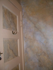
 Here is an example of fun and creative wall painting that effectively jazzes up a bathroom. It comes from the Art School at Old Church, in Demarest, NJ. I love the marblelizing on the walls with the solid paint detailing on the door. This is not a fancy bathroom, but the paint treatment does wonders to create a statement.
Note, too, the hooks on the door. Hooks are marvelous and thoughtful additions to a public restroom.

This other photo from the same location but another bathroom shows a beautiful student painting, adding a lot of class, whimsy and inspiration.
By the way, if you are concerned that you're not an art school and don't have ready access to all this creativity, consider teaming up with your local elementary schools to showcase the artwork of your community's young picassos in training.
 This picture comes from of my favorite Thai restaurant Kratiem in Englewood, NJ. In the bathroom you'll notice a sweet flower arrangement on a delicate corner table. Very nice touch!
La Quinta Inn in St. Louis, MO had a mandatory piece of art over the commode. Not particularly inspiring, but given how particularly uninspiring - albeit functional and clean- the bathroom was, the artwork helped!
This article from 3/10/2005 titled Restaurant Bathrooms discusses some of the frustrations with bathroom sink design and keeping one's hands clean while navigating from sink handles, to paper tower dispenser to the door handle. A practical piece of advice: "include a waste receptacle close to the door so clean people can toss the dirty towel into it on their way out the door."
My friend Sarah shares the following comments. Do check out her pictures on flickr:
+ Chase Park Plaza which won the St. Louis "Bathroom of the Year" award for 2006, according to the local arts and entertainment newspaper [writeup from the St. Louis Riverfront Times: Best Public Restroom].
Although the next two are chain restaurants, she likes them because they are consistently aesthetically appealing and offer a "little extra" no matter what city you are in...
+ P.F. Chang's-check out the beautiful/calming sink area.
+ Macaroni Grill-many thought the bathroom was attractive and always clean, but I really liked the fact that they had Italian language tutorials running, as it always made for great conversation when you got back to the table and shared your newly learned vocabulary words with your dinner companions.
[Check out the bathroom pictures of the Stardust Restaurant in Alexandria, VA. I've never been, but they certainly are creative!]
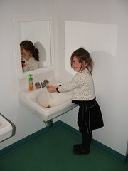
 This last photo shows a bathroom sink that has been scaled to meet the needs of the target customer: 3, 4, 5 and 6 year olds. Again, not fancy, but immensely functional. The scale acknowledges that the most important people in this building [a school] matter immensely. It also empowers these youngsters to take responsibility for handwashing.
Given these ideas, how might you create a facility that meets the needs of your most important customers? After all, What Do Women Want? Thoughtful Solutions.
Some of today's Bathroom Blogfest '06 postings include:
+ Stephanie Weaver at Experienceology has posted A Star Bathroom Extends Your Brand
+ Maria Palma at Customers Are Always has posted Restrooms In Tijuana's Night Clubs
Technorati Tags: ladiesrooms
Del.icio.us Tags: ladiesrooms

No comments:
Post a Comment
Reminder: Please, no self-promotional or SPAM comments. Don't bother if you're simply trying to build inauthentic link juice. Finally, don't be anonymous: it's too hard to have a conversation. Thanks, CB