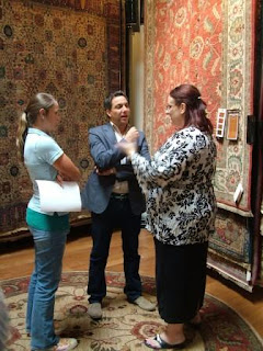
 Thom Filicia just completed the third stop on his national tour: Phoenix, AZ, and it was terrific! Possibly even the best yet [sorry, Boston and Chicago!].
The next and last stop for 2007 for “Decorating from the Floor Up” will be at the Seattle Home Show 2, Quest Field Event Center, 1000 Occidental Avenue S., in Seattle, WA on Friday, October 12, 2007 at 2:00 p.m.
Tickets are available at the door or at Karastan's website. General admission to the Home Show is $9 and an additional $10 ticket is required for Filicia’s “Decorating From the Floor Up” seminar. All proceeds from seminar ticket sales will be donated to Susan G. Komen for the Cure, the world’s largest grassroots network of breast cancer survivors and activists.
Don't miss it!

Observations from the Phoenix event:
First, what a great crowd of designers, realtors and individuals simply looking for design project ideas and inspiration.
I overheard many afterwards expressing surprise at how much fun they had had [some dragged in not-so-enthused significant others!]. Thom's manner is so engaging and enthusiastic that you just can't help but become interested in what he's describing. And, yes, he likes to invite participants onstage to help out with the design decisions.

This being my third Designing From The Floor Up event, I appreciated how Thom customizes the presentation to the location. He brought up Taliesin West, The Frank Lloyd Wright Foundation where approximately 70 students intensely study architecture [read more about Taliesin West in Frank Lloyd Wright's Spirit Lives On at Taliesin West by Judy Hedding] and The Arizona Biltmore - two remarkable architectural masterpieces in the immediate vicinity.
Did I mention that Thom is warm and engaging? And he LOVES design related questions. The tougher the question, the better! Uncannily, with each question,
 he seemed to immediately visualize the design challenge and the architecture of the space without needing a great deal of detailed description. You could see him become 'uber-designer', internalizing the situation being described, and then peppering the individual with questions before offering his suggestions.
According to his manager, Thom has a photographic memory for floor plans; from a verbal description, he can immediately conjure up a three-dimensional visualization of a space. Pretty amazing to see that in action!
Here are some of the notes I took:
Your house should look just like you; it shouldn't be impersonal. Your space should look good and tell the story of the person who lives there. [I love the notion of story coming up for one's home.]
 For inspiration, consider starting with something unique that captures meaning for you or inspires you; use that to make the color and texture decisions to decorate that space. It's important, too, to mix pieces as you do when you dress yourself.
[The Style Network’s Dress My Nest takes that premise, using clothing choices as inspiration.]
The notion of balancing material choices came up repeatedly during this session. Phoenix houses capture almost uniformly the Southwestern design motif.... with lots of hard materials like tile. Balancing the choices means not having a monotonous feel to the whole space.
Think of the times you have been in a hotel where all of the furniture pieces match; they're part of a set. Does that seem interesting? Or, is it more intriguing to have a mix of pieces and styles? Thom suggests that pieces create a relationship, rather than compete with one another. The way to do that is by NOT having the same of everything.
If you have too many cold elements -- e.g., stone, tile or granite throughout the house, plain sheet rock with paint on the walls -- then add warm elements like wood, rugs, carpet, woven wall coverings. Definitely select a primary floor surface product to unify the overall look and feel of the house, but create points of difference in each of the individual spaces. He urged decorative vs. architectural changes, using the walls or the rugs to add decorative elements rather than automatically making architectural changes.
Many questions, too, about how to adapt a timeless or timely design - his two themes - to a Southwestern motif.
If you're interested in seeing the timely and timeless rooms Thom created, visit Vee One Studios. They created the visualization tool to help illustrate Thom's design scenarios and some of those scenes are available online. It was powerful.
If you can get to Seattle, don't miss Thom!
Previous stories about “Decorating from the Floor Up” include:
- Come Decorate From the Floor Up With Thom Filicia in Boston
- Time For Decorating From The Floor Up
- Thom Filicia Is Coming to Phoenix
I also located this article titled Fashion designers focus their stylish ideas on rugs by Fran Golden, Apr. 27, 2007 which talks about Thom and Designing From the Floor Up.
Disclaimer: Wear-Dated is a sponsor.
Technorati Tags: Wear-Dated Karastan Thom Filicia Decorating From The Floor Up Seattle Solutia
Del.icio.us Tags: Wear-Dated Karastan Thom Filicia Decorating From The Floor Up Seattle Solutia

No comments:
Post a Comment
Reminder: Please, no self-promotional or SPAM comments. Don't bother if you're simply trying to build inauthentic link juice. Finally, don't be anonymous: it's too hard to have a conversation. Thanks, CB