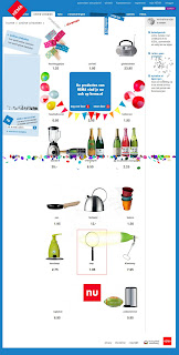
HEMA Creates Fun Digital Retail Experience
What's Your Take? Success or Waste of Time?
Back in July 2009, my friend Linsey Levine sent me a link to a preposterous product website for HEMA, the Dutch department store. This wasn't a link to an ordinary product web page. Quite the opposite! Take a look for yourself. Visit http://producten.hema.nl/, sit back and let the page unfold...
What do you think?
Fun, no? Clever, too?
I've experienced it several times and really enjoy the whimsical and non-commercial fun of this web page. And, assuming it's an official page, it's coming from a department store first established in 1926. Talk about having a sense of humor and keeping up with the times...
I'm curious, though. What is the story behind this page? How long ago was it created? From the site, you can't navigate anywhere. Although the branding is related, it doesn't quite match up. So, how does it relate to the official HEMA web site? Is it primarily to create word-of-mouth buzz?
I found recent mention of it in Site of the Week: HEMA [posted on 12/30/09] with very similar information and instructions to what my friend's email included. [I.e.., "You can't order anything (it's in Dutch, anyway) but just wait a couple of seconds and watch what happens. Don't click on any of the item pictures, just wait and see what happens. This company has a sense of humor and a great computer programmer."]
If you Google 'HEMA,' the goofy product page ranks first, ahead of the official website. And, the Wikipedia entry includes reference to it.
So, a few questions for you:
+ What's your take on this digital retail experience?
+ How do you think it enhances the HEMA retail experience?
+ Have you come across similar fun retail experiences?
+ Would you do anything differently?

6 comments:
I thought this was really cute and fun. However, with a business hat on I'm struggling to see what it's for. It does give a good indication of the product range offered but there is no click through facility or even a way to leave your details.
Maybe it is purely to show that some businesses have a sense of humour. In this day and age is that enough to make someone shop there?
Averil, I had the same reaction. I keep wanting to see it integrated into the full HEMA experience: working links or connection to the main site or something...
I need to ask my Dutch friend Alex for his opinion!
Thanks for sharing your thoughts. Happy 2010!
CB
As a Dutchman my perception of HEMA is simplicity, value for money and reliability. What you see is what you get: Ok quality for reasonable prices. In the Netherlands HEMA is a very strong brand now even extending into insurances and online training. Although the site you mention is very funny, it would not have been my idea. I think it goes against the notion of reliability and WYSIWYG principle.
Thalatta, many thanks for sharing with us a Dutch perspective on HEMA. I would love to understand why the site was set up and what it has done for HEMA - especially given how you describe the company. Best, CB
Hi there, funny coincidence took me to this site. I was research several campagnes about HEMA. Note I live in the Netherlands.
This campagne was intended as an viral campagne. So no usability or whatsoever came in play. This champagne clearly is in line with the playfulness the brand HEMA carries. I guess it is also hard te see when you're not dutch, because the brand HEMA is almost a equivalent for being dutch.
Also this campagne was to emphasis the possibility of shopping online. At the time (2008) online shopping was becoming more popular in the Netherlands, but not enough. So to attract attention they created this viral.
Is that good enough info ?
Bruce, I'm so very pleased you came across my site and this article!
And, yes, this is very good enough info! What's fascinating is that the site/campaign is still available and continues to generate conversation [e.g., this post and comments]. I expect it has been successful as the main online shopping site looks to be robust and engaging.
Bedankt,
CB
Post a Comment
Reminder: Please, no self-promotional or SPAM comments. Don't bother if you're simply trying to build inauthentic link juice. Finally, don't be anonymous: it's too hard to have a conversation. Thanks, CB