Flooring The Consumer on Simple Marketing Now

Please visit Flooring The Consumer's new home on SimpleMarketingNow.com where you can subscribe to receive updates to blog articles in real time!

Monday, November 27, 2006

Elmo Saves Christmas... But, Not From Retailers

Have you experienced the movie about how Elmo, from Sesame Street, saves Christmas? He wished for Christmas every day, only to realize that even the best things in life lose their meaning when they happen too frequently. They become ho-hum, taken for granted, boring, and even dreaded. You'd rather avoid them!
Well, that's the feeling I get when I notice that Christmas starts earlier and earlier each holiday season.

This year, I noticed the first signs around Labor Day when our local garden store - Max Is Back - displayed those large inflatable outdoor Christmas globes. Lowe's counteracted for a few days. Luckily, I was able to push it out of my mind.

October - normally Hallowe'en territory - was inundated with Yuletide stuff. And, forget about November! My 5 year old noticed and commented on it! Can you imagine? The youngest members of our society consider it strange! She said "Mama, why is there Christmas stuff out? It's not even Thanksgiving."

I'm not sure whether I feel validated or simply sad when I read others' commentaries on the subject. Brand Experience Lab's David Polinchock shares this rant about his town's decorations in Advertising Age - Christmas Marketing Creeps Backward Into October and refers to the 11/12/06 article from Ad Age Christmas comes but once a year-in October with subtitles "Christmas Marketing Creeps Backward Into October - Lowe's, Sears, Wal-Mart Rush the Season" by Mya Frazier. She states "..some consumers found themselves rooting through the Christmas candy to stock up for trick-or-treaters." Absurd!

Now, although I appreciate that Best Buy has been doing a lot of work to better connect with women consumers and that their October [Holiday] print ads were part of a "...new strategy to reach out to women shoppers better and understanding they start shopping earlier and never finish shopping", does that really mean having to be heavy-handed about Christmas? Aren't there more subtle ways to communicate with customers about product ideas and gift-giving concepts?

The 11/30/06 issue of The Seattle Times features this article titled Holiday retailers can't wait by Monica Soto Ouchi. It, too, offers examples of 'Christmas Creep' with Old Navy coming out with decorations before Hallowe'en, and Cost Plus before Labor Day. Ugh! It also shares some excellent stats. Despite all of this creep, it seems that consumers procrastinate more each year. Could it be that - like the beneficiaries of Elmo's every-day-is-Christmas-curse - consumers glaze over these almost desperate in-store holiday pleas???

George Whalin shares some interesting data from the National Retail Federation in Black Friday: The Battle for Consumer Dollars!: "14% of consumers begin their holiday shopping before September, 6.5% in September, and 19.9% in October." Nonetheless, does that really justify broadcasting 'Christmas' on LOUD starting as early as September? Or does it? Some consumers are constantly in shop-mode for Christmas, starting as soon as the current holiday is over. So perhaps we should indeed have Christmas every day!

Wouldn't consumers respond better to retail messages that were more clever, more varied, more season appropriate? That would certainly get my attention, and prevent me from tuning out. Of course, such an approach would go hand-in-hand with a merchandising mix unique to the store and a retail experience second to none! It would mean truly understanding and meeting the needs of consumers and providing stellar service [which The Seattle Times article suggests is what good retailers will be emphasizing]!

Retail Design Diva lists the Top 10 Retail Trends for the Holiday Season. Of those, I consider scent marketing fascinating. I'm noticing it more and more both in-store and in the news.

The other interesting trends are webbier and storemediaintegration. So far, everything I've purchased for the holidays [granted, not much, and purchased earlier in the year!] [and except for one-of-a-kind pottery from shows at the Art School at Old Church and especially the 32nd Annual Pottery Show, which showcases pottery by the country's most renowned potters] has been online because the in-store experiences have been lacking. I am so grateful to retailers with seamless web/store environments! My stress level immediately diminishes. It's fascinating to note which retailers use web/technology in-store to expand store selections and inventory. For example, Borders is offering more in-store web access, and Sears readily makes online ordering available for its Land's End products especially when items in-store are out-of-stock. Smart.

Isn't the end goal to make it so easy for a consumer that she will have no desire to go anywhere else? And, by not making it a matter of price wars [because your product/service are differentiated], margins benefit, too. Methinks Elmo would approve. Make the true Christmas Holiday season special in-store, and come up with different, creative ways to capture holiday magic at other times of the year. Right?

By the way, isn't it interesting that Nordstrom respects the traditional Friday-after-Thanksgiving time frame? Per the AdAge article, "Nordstrom is surprisingly subdued, and there's not a string of lights or evergreen to be found, yet it's packed as shppers flock to the luxury-department-store chain's half-yearly sale. The chain sticks to the after-Thanksgiving rule once uniformly obeyed across the retail industry and waits to even setup holiday decor until the day before Black Friday." Why am I not surprised?

Technorati Tags: , , ,

[Disclaimer: my husband is a potter and affiliated with the Art School at Old Church. The school really does have unbelievably gorgeous pottery shows. And, the annual show is a don't miss opportunity to meet the best potters in the nation.]


Monday, November 20, 2006

Giving Thanks

give thanks originally uploaded by organicpixel.
I love Thanksgiving. It's such a warm and friendly holiday, focused on hospitality and appreciation for the good things that have happened. And, it's a prelude to further merriment.

Thanksgiving being such an American holiday, it's often difficult to explain to non-Americans. To my Parisian family [my Mom is French], we found it simpler to describe Thanksgiving as the feast during which Americans ate as well if not better [!] than the French [Mon Dieu!] - and left it at that. Which is probably why I found this Art Buchwald story titled A Turkey Dinner With French Dressing absolutely hysterical when I first came across it in the late 70s/early 80s [then, it was titled "Le Jour de Merci Donnant". BTW, the premise of the article works with just about any language, so if you were to consider "Spanish Dressing" Thanksgiving would become El Dia de Gracias Dando].

In the spirit of giving thanks, I'd like to highlight some folks who have been wonderfully giving in the blogosphere. I heartily recommend that you visit their sites, if you haven't already:

Mike Sansone from Converstations offered me my first blogtip in October 1st: Blogtipping. I heeded his advice and immediately benefitted by connecting with Susan Abbott [see below]!

My second blogtip came from Drew McLellan at McLellan Marketing Group's Drew's Marketing Minute in Blogtipping -- November '06. Drew, I have trackbacks enabled.

My third and most recent blogtip came from the creator of blogtipping himself, Easton Ellsworth at Business Blogwire in November 2006 Blogtipping Cuisine: Served Fresh and Hot.

I'm extremely proud that Maria Palma's Customers Are Always has inducted Flooring The Consumer into the Customers Are Always Hall of Acclaim in Customers Are Always Incredible Hall of Acclaim Week Two Inductees.

I really appreciate what my guest contributors have posted:
+ Deb Binder with Putting Women In Their Place Front and Center;
+ Sarah Goodman with Going the Extra Kilometer with Iron Girl Judy Molnar and Passing the Torch: Marketing to Moms AND their Daughters;
+ Lisa Contreras with Bloomingdale's Bathroom Makeover;
+ Scott Moore with An Architect's View of Better Lifestyle Centers.
They have added a rich dimension to the conversation. Don't wait too long to contribute more, okay?

Thanks to Susan Abbott from Customer Experience Crossroads and Stephanie Weaver at Experienceology for inviting me to participate in the Bathroom Blogfest. What an amazing ride joining them along with Reshma Anand at What I Do For A Living, Sara Cantor at Curious Shopper, Jackie Huba at Church of the Customer, Maria Palma at Customers Are Always, Linda Tischler at Fast Company's blog FC Now and Sandra Renshaw at Purple Wren. And, thank you to our Wear-Dated reps. for sharing so many wonderful perspectives! I promise you, there will be many more opportunities!

I'm really grateful to my Mom for sharing her story in My Mom is in the Market For Carpet [be sure to read all 3 parts]. Do you know she was surprised that my French cousins knew all about her saga when she was in Paris 3 weeks ago? I wonder which friend or family member will be next? If you have a story, don't be shy. Send me an email.

Thanks, all, and Happy Thanksgiving! Joyeux Jour de Merci Donnant! !Feliz Dia de Gracias Dando!

Technorati Tags: , ,

Friday, November 17, 2006

Hugs or Relentless Customer Focus!

Jack Mitchell and Pamela Miles extended a huge hug to me in response to A Good Hug is Worth and invited me to visit them. So, on September 21st, I went to Richards of Greenwich, CT and spent an inspiring morning experiencing firsthand the power of hugs!

Jack Mitchell - if you remember - is the author of Hug Your Customers and CEO of Mitchells/Richards/Marshs. Pamela Miles is his most gracious Director of Business Development, and an excellent 'hugger'!

Everyone I met was intense and focused. I arrived early in the day on a Thursday. The weekend was ahead and the pace was about to get much busier. The sales associates were relaxed, interactive, but busy. Busy doing followup with their key customers. Busy getting product together for upcoming customer meetings. No one was lounging about!

From reading the book and hearing Jack's speech, I knew that database systems were important to the tracking of customer information and I was curious to see the 'playbook'. Well, the playbook is essentially a printout of information that captures the play cues for the week: who to call about birthdays or a golf outing, or a special trunk show. Whose garments would be ready for pickup, for alteration... In essence, the golden nugget reminders to followup with key customers based on information gathered from previous interactions [i.e., this is the Client Accumulation Program - inspired by Michael Yacobian who works with Nordstrom on training], sales history, new product arrivals, etc... Each person had his or her own style for making use of those nuggets. That part didn't matter. What did is that the organization empowered its folks to focus ruthless attention on their customers and then got out of their way.

What a concept! To have the organization do the tedious detail work so the associate can shine with the customer, using technology to automate the non-value added work by taking chunks of data and turning those into meaningful and actionable bits of information. [A wonderful resource - Blue Lacuna - has helped us do some of that.]

This retail organization uses the retail cycle to its advantage. More specifically, we all know that peak retail times are during the weekend. Mondays and Tuesdays tend to be yawners; things get a bit more active on Wednesday; on Thursdays things start chugging along and then - bang, it's Friday, watch out for the weekend! Well guess when Richards/Mitchells/Marshs conduct many trunk shows or special events? That's right - on the slow days. The day before my visit [i.e., Wednesday] Richards had had a special Italian chamber of commerce event. It yielded great results!

Given the hug strategy, consider this 7/28/2006 article from Business Week online titled Ruthless Focus on the Customer by Jeneanne Rae. It discusses how critical the customer experience is in ensuring loyalty, profitability, referrals and brand zealotry.

In addition to referencing "Moments of Truth" [a concept that Disney focuses relentlessly on; i.e., all of those critical points of consumer interaction where -if any one goes badly- she can choose to leave you], Rae addresses "Brand Values" ["In a world of competing alternatives, brand values provide the guidance and constraints for creative teams to design appropriately." ], "Technology & People", "Co-Creation" ["The next level of value for product and service companies is not only mass customization, but co-creation of the entire experience." ], an "Eco-System Approach" [i.e., think how Apple has put a personal entertainment delivery system [a.k.a. iPod] into so many consumers' hands by reinventing the whole category and experience], and "Start With the Customer". Think about and like the consumer, experience what the customer experiences, and try Walking in Her Shoes: the insights will be priceless!

In the "Technology AND People" section, the article refers to the role of technology in enabling ruthless focus on the consumer: Link information-technology strategy with human-resource models to create mass customization. ... we have found that companies whose systems are turbocharged to deliver sophisticated insights regarding customer behavior and lifestyles have an edge in developing great customer experiences... to drive better, more personalized, experiences for customers, and more profit for the corporation at the same time. Studies have shown the highest return on operational investments comes from fostering repeat customers—making training, and incentives for front-line staff of critical importance.

Good advice, right? Well, also totally practical. That's what makes the Hugging Strategy so powerful. It's ruthlessly and relentlessly focused on the customer. Any action that isn't about the customer has no reason for being. It is ALL ABOUT THE CUSTOMER!

Yes, you do need information systems [your brain and a manual tickler system will go so far] to empower your people, to arm them with knowledge and make them smarter and quicker and more thoughtful than normal. But, that information MUST be about the customer. Your brand value represents your commitment to your customer's experience and how consistently you implement that day in/out. If you are serious about your customer's experience, you will even encourage her to customize her experience with you [a.k.a. co-creation]. Pamela shared the example of a valued customer caught between a rock and a hard place with work obligations and needing to go shopping for her daughter. Her Richards sales associate solved the matter by taking the daughter shopping. Wow! I bet that customer is not only loyal beyond belief as a result, but has also told everyone she knows!

Maria Palma at Customers Are Always captures these actionable and practical 10 Ways to WOW Your Customers. They are all about showering your customer with hugs. As you consider all of the retail choices that your consumer faces, how will you choose to differentiate your retail experience? How will you demonstrate your unflagging, ruthless and relentless commitment to her experience?

Tags: , , , ,

Wednesday, November 15, 2006

How Do You Create Buzz?

Mark Hughes, CEO of Buzz Marketing, author of "BuzzMarketing" and former VP of Marketing for Ebay's Half.com, is mesmerizing! He knows how to tell a story, both in person and via his book. He just exudes buzz!

I met Mark at a May 2006 Columbia Business School Alumni Club of NYC event during which he shared with us the essential elements of buzz marketing. Here follow some of those words of wisdom!

The goal of buzz marketing is to generate such a level of word-of-mouth discussion about your brand [or product or store] that talking about your brand becomes entertaining and fun. Traditional advertising doesn't do that. For example, Reckitt Benckiser owns the Lysol brand and does plenty of traditional advertising. But what generated considerable Lysol buzz was their sponsorship of the New Jersey Turnpike bathrooms [note to self: include in 2007 Bathroom Blogfest!], which has led to an incredible number of consumer reactions, lots of postive feedback, constructive and involved comments [i.e., all consumer interactions with the brand]. That's buzz!

The biggest issue with traditional marketing is that TRUST in consumer advertising is down 41% in the past 3 years. Add to that clutter, and a power shift to consumers driven by the internet and it's no surprise that - as shown by a Euro RSCG Study titled "Wired & Wireless: High-Tech Capitals Now and Next" - word-of-mouth is 10x more effective than TV or print. And additional research from Ogilvy & Mather says that consumers are 6x more likely to read an article than an ad. This tells us that content matters to the consumer.

Whereas traditional advertising represents a one way model [i.e., push], word-of-mouth is a two way dialog which leads to discussion which then becomes content. The brand ENABLES the discussion; and consumers make the difference in creating the discussion.

Buzz works when a marketer does the following,
- Gives consumers a GREAT story [that's the root of the buzz].
- Puts the brand 2nd [in other words, if the story is sufficiently buzz-worthy, the brand will benefit. If the brand is the story, you haven't given consumers a great enough story].
- Follows the 6 secrets:
  • Push buttons [there are 6 possible buttons]
  • Capture media
  • Advertise for attention
  • Climb Buzz Everest
  • Demand creativity
  • Police your product
#1 PUSH BUTTONS:
We routinely talk about the unusual, the outrageous, the taboo, the hilarious, the remarkable and secrets. We don't talk about the boring. What we talk about is rooted in EMOTION. To create buzz, it's critical to fit your story into what people want to talk about.

#2 CAPTURE MEDIA:
Example - Half.com used the back of fortune cookie fortunes to advertise. The news media picked up the story because it was so unusual, and sales increased 6x. [Half.com was able to track redemption based on codes on the fortunes.] To capture media, consider that the 5 most frequently written news stories are:
1. David & Goliath [e.g., Ben & Jerry vs. Hagen Daazs]
2. Outrageous & unusual [e.g., Half.com renamed the town of Half, Oregon to Half.com, Oregon]
3. Controversy [e.g., John McEnroe, the bad boy of tennis, was much more memorable than Pete Sampras]
4. Hot in Media Already: media frenzy and piggy back
5. Celebrities

Examples: Brokeback Mountain - the gay cowboy movie. Banned at one movie theater in December; at that point, box office numbers doubled and movie netted out 134% better than the competition [Geisha and Producers]. This is similar to the controversy around Passion of Christ.

#3 ADVERTISE FOR ATTENTION
Advertising is NOT about impressions. It's about connecting with the consumer and gaining their undivided attention. Word-of-mouth does that.

#4 CLIMB BUZZ EVEREST
Go where no brand has gone before. For example - Rit Dye. It was nowhere in the marketplace until it connected with some young kids interested in creating a fashion statement [tie-dye]. they asked the company to donate some t-shirts for a concert [Woodstock] where the concept got so much visibility [Janis Joplin and others were on-stage wearing tie-dye shirts] that the designer Halston became interested, and then fashion editors started promoting it. The brand had no money to do conventional advertising, but through buzz achieved more than was ever possible through traditional means.

#5 DEMAND CREATIVITY
Show your warts; be personal, not corporate. The consumer mood has changed and consumers no longer trust corporations. It's much more important to be yourself and create a personal connection with your brand. For example, the Pepsi Challenge used real footage; it showed that footage even when Coke was chosen over Pepsi! This was real and consumers connected. Think of the company websites you've visited that show real pictures of employees and how much more connected and trusting you feel toward that company.

#6 MUST POLICE YOUR PRODUCT
The key research stat you need to track: "would you go out of your way to recommend your product/brand to a friend?" [this goes back to Fred Reichheld's book on the Ultimate Question - see Good Tea. Nice House.] Don't ever underestimate the power of negative word-of-mouth either [see I Can't Get No Satisfaction]! Hughes gives the example of a VW with a piece of paper taped to the back window saying "don't buy this car; it's a lemon". Don't you think consumers will take that sign seriously? It's really important to have a GREAT product and to monitor its greatness relentlessly.

Hughes reminded the group that talk [word-of-mouth, buzz, ...] works because an audio stimulus stays in the brain 5x longer than a visual one before it starts to fade. That's amazingly powerful!

His 3 KEY TAKEAWAYS are to be personal, not corporate, put your brand 2nd!, and GIVE them a story because the story is the currency.

The book [see Recommended Reading/Business Trends] is definitely worth reading.

You can learn more about Mark Hughes and Buzz Marketing at iMediaConnections via a four part series titled Integrated Direct Marketing. Part I and Part II capture Mark's comments about Buzz Marketing. Also, consider this excellent article on Marketing Profs titled How to Manage and Measure the Word of Mouth Revolution by Justin Kirby from 2/28/2006 which refers to the Euro RSCG Study above.

Technorati Tags: , , , ,

Monday, November 13, 2006

An Architect's View of Better LifeStyle Centers

I am thrilled to share the following guest post from Scott Moore, a.k.a. WiZuM, whose photo of Atlantic Station anchors Atlanta's Atlantic Station - A Lifestyle Center. Scott, a-soon-to-be-architect, is a designer and project manager for an architectural firm in the Atlanta area. He made insightful comments [see Atlanta's Atlantic Station - A Lifestyle Center comments] about how Atlantic Station falls short in terms of fully integrating life/play/work and suggested better examples. I invited him to share these with us.

Cobb Energy Performing Arts Center originally uploaded by Wizum.
As I mentioned before, I am an architect-in-training, and have a passion for the built environment. I don't know why, but I do. I have a passion for design, and creating places for people to live, work, play, and worship.

Atlantic Station [AS] originally intrigued me. But, as you can read from my comments to the post, I eventually became disappointed with it once I had a chance to really check the place out. So here are a couple of "lifestyle center" type developments that do a much better job.

Smyrna's Market Village - GA
I live only about a mile from the "Market Village" located in Smyrna, GA and was fortunate enough to actually work on this project's master plan with architect Mike Sizemore, founding principle of Sizemore Group. Unlike what happened with AS, this one was built following the master plan to almost perfection (and that doesn't always happen). What is nice about the Village is that it is very intimate and pedestrian friendly. It doesn't compare in size to AS but it works much better.

Another big difference compared to AS is that there are no department stores or places like that. There are several places to eat, from a Moe's to a nice Italian joint to a sushi restaurant, and many small shops that range in products and things with apartments/townhomes ABOVE the stores. This whole development has a very traditional aesthetic and is part of the City of Smyrna's "downtown" redevelopment [i.e., the "city complex"], which is where City Hall, the city Library, community center, and police station are all located. Since all this has been built the market in the city has been incredible and some wonderful places are being designed and developed right around the Village area. It has acted like a rock being thrown in a pond: the ripple effect is just beginning to really take hold. You can get a visual feel for it here.

The Market Village definitely represents a "New Urbanist" development, representing a collaboration between the city, a private developer, and several architects and builders, with a focus on having housing be within walking distance from the village resources. Also check out the Smyrna Market Village website.

Glenwood Park, GA
Another interesting lifestyle center type development is Glenwood Park which is being developed and funded by former Mindspring Founder Charles Brewer. Since leaving Mindspring, after the Earthlink merger, he has started a residential development company dedicated to "walkable communities" based upon the principals of New Urbanism. In other words, "smart" and "green friendly" urban design. The development just recently opened and is only about 50 - 60 % completed and I don't think any of the commercial or retail space has opened yet. But this development has promise and hopefully will have the same type of "ripple effect" that the Smyrna Market Village has had.

Now, to be clear, these 2 examples are significantly smaller in scale than Atlantic Station and that's an important point. Atlantic Station is much larger than the Market Village and about twice the size of the Greenwood Park development. It has two high rise buildings and a third one under construction. Following those, there are plans for at least two or 3 more high rise buildings to be completed once the whole AS project is 100% done.

From a retail perspective, it comes down to the scale issue again. AS is a huge development and the retail/commercial parts of it are like a outdoor mall, but in a very urban center. Also, the kinds of stores at AS are different from those in Smyrna's Market Village and possibly from what Greenwood will eventually have. AS has national chain stores and franchises where Smyrna & Greenwood have more local retail representation.

Despite the difference in scale, these two examples are still much better places [i.e., think of Ray Oldenburg's 3rd places from his book "The Great, Good Place"] and were better executed in their planning and design.

-----------------------

As a new retail format, lifestyle centers are definitely worth watching. Given that they are about better integrating the various aspects of our living activities, they should represent fascinating opportunities to better integrate shopping experiences into our lives. The flip side is that the traditional shopping experience must be reinvented to fit more holistically into the world of New Urbanism....

To learn more, visit the New Urbanism website or visit Wikipedia, where the entry on New Urbanism says:

"New urbanist neighborhoods are walkable, and are designed to contain a diverse range of housing and jobs. New urbanists support regional planning for open space, appropriate architecture and planning, and the balanced development of jobs and housing. They believe these strategies are the best way to reduce the time people spend in traffic, to increase the supply of affordable housing, and to rein in urban sprawl. Many other issues, such as historic preservation, safe streets, green building, and the renovation of brownfield land are also covered in the Charter of the New Urbanism, the movement's seminal document. Because new urbanist designs include many of the features (like mixed use and emphasis on walkability) which characterized urban areas in the pre-automobile age, the movement is sometimes known as Traditional neighborhood design."

Technorati Tags: , ,

Thursday, November 09, 2006

Bernice Kanner & Marketing To The Sexes

On 10/12/06, I attended a panel discussion titled "Marketing to the Sexes" [previewed in Upcoming NYC Event... 10/12/2006]. It was an exciting, action-packed, opinionated session that could have easily translated into a full-day event rather than 1.5 hours. It was also an amazing opportunity to meet and experience firsthand a wonderful woman: Bernice Kanner.

Bernice Kanner added humour, energy and insight to the panel discussion exchanges. So, I was shocked and saddened to read in the 10/30/06 issue of Ad Age a tribute to Bernice titled Kanner lived life to its fullest by Allen Rosenshine, BBDO chief. This article as well as her obituaries in the 10/31/06 issue of The New York Times and the 10/26/06 Ad Age give you an appreciation for the remarkable accomplishments of this woman.

Here follows a summary of the panel discussion:
Alpa Pandya, Managing Director for Strategy at Sterling Brands, moderated the discussion about diverse marketing approaches ranging from male-only targeted entertainment & products to women's beauty products. Financial services bridged the two extremes, although moving toward the female side! Overall, it was a lively discussion, and we just needed more time to fully explore all of the perspectives that the panelists represented.

The conversation also touched on alternative forms of marketing and recognized that relying solely on traditional communications [i.e., TV or print advertising] was insufficient given the increasing fragmentation of traditional media. Add to that how control has shifted to the consumer in large part because of the internet! In fact, Pandya had hoped to share a new world premiere Sony commercial showing how to take advantage of TiVo by allowing consumers to choose the ending!

Barry Herstein - SVP, International Payments & Communications, American Express - explained that American Express has historically focused on male business travelers. But, with women playing a larger role in corporate business AND travel, it realized that it should be appealing to women. At this point, American Express is at the early stage of the transition, but I've noticed more AmEx reward direct mail pieces - for example - promoting experiences and context over products.

AmEx discovered in doing research that women were better able than men to articulate their needs, leading to a richer discussion. They think more expansively, uncovering benefits and positionings that the company hadn't considered. In so doing, AmEx learned that by designing for women, they appealed to men, too.

For example, whereas traditional AmEx material promoted a message about 19% interest rate [more male focused], women respond to a message about financial planning to protect her family. The different approach not only appeals to women, but also connects with men, and promotes more services. That's an opportunity! In financial services [as in many businesses] selling to women takes more steps, but when you earn her business, she is more loyal. Women are also better investors. Women take care of everyone else before they take care of themselves whereas men are more individually focused and take care of themselves first.

Herstein made an interesting point about how AmEx is using direct sales to reach people, especially outside of the U.S. in countries with unreliable postal systems. In most of the world, direct sales is a female channel, growing 4x faster than retail because it is consultative selling.

David Lang - Senior Partner, Director of Programming, Mindshare Entertainment, which represents 13 of the top 20 worldwide advertisers including Axe men's fragrances, creates content for clients. To come up with the right content, Mindshare Entertainment [ME] must truly understand the target audience it is trying to reach [where they live, how they interact, what they watch...]. So creativity must be analytically based. Only then can ME come up with solutions that are relevant to that audience. Although many options are avaible, the right choice truly depends on what you are trying to achieve. For example: women use the internet differently than men do so you need to develop a different message for each. They work with Spike TV, which is extremely male-focused in its programming and messaging, and any content developed MUST be relevant to the male market.

For Axe exfolient, ME created a "mockumentary" aimed at men 18-24, and appealing to the sophomoric guy mentality. It's fun, subversive, comedic and mysterious. If you aren't the target audience, chances are you won't get it! The mockumentary refers viewers to The Order of the Serpentine for a free sample of product and represents the ONLY commercial element of the whole program. This isn't advertising! Rather, it represents entertaining content that is relevant to the target audience/consumer.

Dario Spina - SVP Marketing, Spike TV, commented on the ME Axe piece explaining that the content is well positioned and targeted. It works quite effectively for Spike TV which is an entertainment brand for men created because network tv and cable offer so much content geared toward women [e.g., WE, oxygen, A&E]. Spike TV has listened closely to its core audience and developed programming content that their audience wanted. They refer to this approach as 'superserving'. They are totally committed to always being true and relevant to their core consumer.

Bernice Kanner - Author, How to Reach the Hearts and Minds of Today's Most Coveted Consumer - Women, stated that age identity is often a greater barrier than gender. Men and women from different age cohorts have different expectations and behave differently, making it very important to develop the right communications message and vehicle. Herstein added that youth is blurring some gender lines, making it that much more important to understand the generational aspects [e.g., American Apparel takes a blurred gender approach in selling apparel.]

She boiled the essence of women to CHARGE [from her book: Control, Harmony & love, Amusement/fun, Respect, Greatness/meaning and Enough]. Men, on the other hand, were better represented by SUPER [Sex, Ubermensch/control/win, Privilege, Evolved [electronics/technology, Recreation] which -after a spirited discussion about the importance of male-bonding and the desire to return to bachelorhood days- she revised with a C for 'club' instead of the P.

Ms. Kanner showed great humour, reacting quickly with witty comebacks that had everyone in stitches. She both lightened the mood, yet added weight to the topic.

Joanne Hsieh, class of '03, Director of Strategic Planning & Business Development, MAC Cosmetics [Estee Lauder] explained that MAC targets professional cosmetic artists, both men and women. This is a higher growth beauty business in a non-traditional category, and MAC takes a cross gender approach. The company doesn't do national advertising, except for charity related programs [e.g., VIVA glam, lipstick where 100% of proceeds went to AIDS], and will get Rube Paul, or Boy George to participate. The positioning is professional and authentic, inspired by fashion, life backstage and the chief influencers: professional makeup artists. Packaging is basic and functional, adding to the mystique.

Anthony Cirone - Global Brand Development Director, Dove Body Care, Unilever - Dove real beauty. Cirone explained that great marketing depends on great insight. Dove conducted a survey 4-5 years ago, in 10 countries and learned that a small percentage of women considered themselves beautiful. This was the spark for the Dove real beauty positioning: realizing that the beauty industry has actually been detracting from self-assurance and self esteem! To sell the concept internally [it was considered a bold and risky direction], the company went about interviewing the daughters of key stakeholders who also shared this doubt about their own beauty.

The Campaign for Real Beauty created a public debate on the matter via billboards encouraging viewers to define beauty. By the way, if you haven't already, do view the 'Evolution' video on this site. It has caused a huge stir and will foreever change your perspective and appreciation for REAL beauty.

The key takeaways from the discussion:
+ The category will drive the approach to take.
+ Men and women have different motivations.
+ It is critically important to fully understand your target audience.
+ If you are able to satisfy women's needs, you will also appeal to men.

Technorati Tags: , , , , , , , , ,

Deli.cio.us Tags: ,

Saturday, November 04, 2006

Bathroom Blogfest 2006 Comes To a Close....

It has been a wild ride! As this Bathroom Blogfest '06 comes to a close, I share these last few comments:

Angie, our Wear-Dated rep. in Pittsburgh, offered 2 flooring store additions to the Bathrooms That Floor post:

+ The ProSource stores in this area have taken extra measures to have spacious and clean bathrooms. They win the award!

+ Another clear cut winner for the Pittsburgh area is a store in a very rural setting called Larry Lint Carpeting. This stores has several bathrooms, on both floors of his store. They are extremely nice: beautiful tile, attractive fixtures, well lit and clean.

And, some non-flooring bathroom highlights:

Jodi says: We have a new Wild Oats market in Tampa and their bathroom is AWESOME.

Candace talks about her Honda Dealership in San Diego: My Honda Dealership Service Center has a lovely restroom...They remodeled and put in a lovely oval mirror above the basin, non-glare/appropriate & attractive lighting and a rich dark wood cabinet for the basin. They have a chest of drawers with flowers, Kleenex and feminine needs in a basket....Ceramic Tile on the floor...Great contrast to the automotive world... This dealership offers good service in a friendly atmosphere. They always meet the timeframe specified... and they take care of the details as the restroom shows!

My friend Benita sent the following message: I love the "Bathroom' blog posts. Every retailer should know how important this is to their customers who might even stop into a store with a great bathroom, just to make this visit. And... one never knows, might just stay to make a purchase.

Kathy in Amman, Jordan sent the following in response to Your Bathroom Is A Work of Art: I am sorry that most bathrooms in my part of the world cannot be recommended as works of art to anyone! However, there is one “green designer” bathroom at the eco-tourism campsite of Wadi Dana run by the Royal Society for Conservation of Nature in Jordan, which would perhaps qualify. It was designed by architect artist Ammar Khammash – has semi- open air roof, vines growing in from outside, recycled materials , etc. Truly the nicest freshest bathroom I have ever seen at a campsite!

These last examples reinforce the message that details matter to women consumers. They tell her that you care about her experience in your store, and you should certainly be caring about her overall experience given how important she is to our industry. In fact, the 10/30/06 issue of Advertising Age has a fascinating series of articles about marketing to women, including one titled She-Noms: They're Not Your Mother's Consumer. Wake Up and Straighten Out the Jargon of Tech Toys, Select the Beer of Fashion Week. If she's happy, then everybody is happy. by TIFFANY MEYERS. It's worth a serious read and is relevant to all industries, including the flooring industry! Some excerpts:

"There are 6 million more women aged 20 or older than there are men. What makes the 21st-century woman a consumer phenomenon is her deep pockets, born of greater education and clout in the workplace. The rise of the female consumer phenom -- or she-nom -- merits an overhaul in strategic thinking. "

"Women value comfortable retail environments, easy-to-use products, and -- the biggest missed opportunity for those seeking to build buzz among women, says Ms. Brennan -- superior service. Not even the burliest man could dismiss these gender-neutral features as too girly. "If you are meeting women's expectations, you're giving men something they didn't even think to ask for," she says. "

""Environments created with women in mind will often be family-friendly," Mr. Syracuse says. "And [in] family-friendly environments, men will be comfortable as well." "

I couldn't say it any better!

And, with that, you have my final thoughts on the Bathroom Blogfest '06! Many thanks to all who participated, shared favorite haunts and provided valuable perspective. And, many thanks to the Bathroom Blogfest '06 participants. It was awesome! Have a great weekend!

The Bathroom Blogfest '06 participants [and their latest postings] include:
+ Maria Palma at Customers Are Always with The Retailer Who Knows How to Design Restrooms
+ Susan Abbott at Customer Experience Crossroads with Wrapping Up The Bathroom Blogfest
+ Sara Cantor at Curious Shopper. Check out an earlier post of hers Make Yourself At Home. It's a gem.
+ Jackie Huba at Church of the Customer.
+ Linda Tischler at Fast Company's blog FC Now
+ Stephanie Weaver at Experienceology
+ Sandra Renshaw at PurpleWren just posted A Fine Ending To The Bathroom Blogfest '06

+ Thanks to Mary Schmidt for posting about the Blogfest on Friday Martini Time
+ Thanks to Fueld Design Inspiration in the UK for posting Wrapping Up the Bathroom Blogfest

Technorati Tags: ,
Del.icio.us Tags: ,

How to Improve the Bathroom Experience

In Bathrooms That Floor, I promised tips on how to make the most out of what you have. To that end, here are two interesting articles I came across that offer tips on improving the bathroom experience. Although geared more toward the private bathroom, the tips are still relevant to a public one.

This article from the 10/18/06 issue of The Forest Grove News-Times titled 6 ways to give your bathroom a makeover suggests replacing hardware, repainting, and using furniture in the bathroom.

This other article, Customize your bathroom from the Indystar.com Home Style Week, mentions the value of having a single focal point in a bathroom [an interesting mirror, sink or piece of artwork].

I share below photos that illustrate the benefits of some of these tips:

Here is an example of fun and creative wall painting that effectively jazzes up a bathroom. It comes from the Art School at Old Church, in Demarest, NJ. I love the marblelizing on the walls with the solid paint detailing on the door. This is not a fancy bathroom, but the paint treatment does wonders to create a statement.

Note, too, the hooks on the door. Hooks are marvelous and thoughtful additions to a public restroom.

This other photo from the same location but another bathroom shows a beautiful student painting, adding a lot of class, whimsy and inspiration.

By the way, if you are concerned that you're not an art school and don't have ready access to all this creativity, consider teaming up with your local elementary schools to showcase the artwork of your community's young picassos in training.

This picture comes from of my favorite Thai restaurant Kratiem in Englewood, NJ. In the bathroom you'll notice a sweet flower arrangement on a delicate corner table. Very nice touch!


La Quinta Inn in St. Louis, MO had a mandatory piece of art over the commode. Not particularly inspiring, but given how particularly uninspiring - albeit functional and clean- the bathroom was, the artwork helped!


This article from 3/10/2005 titled Restaurant Bathrooms discusses some of the frustrations with bathroom sink design and keeping one's hands clean while navigating from sink handles, to paper tower dispenser to the door handle. A practical piece of advice: "include a waste receptacle close to the door so clean people can toss the dirty towel into it on their way out the door."

My friend Sarah shares the following comments. Do check out her pictures on flickr:

+ Chase Park Plaza which won the St. Louis "Bathroom of the Year" award for 2006, according to the local arts and entertainment newspaper [writeup from the St. Louis Riverfront Times: Best Public Restroom].

Although the next two are chain restaurants, she likes them because they are consistently aesthetically appealing and offer a "little extra" no matter what city you are in...

+ P.F. Chang's-check out the beautiful/calming sink area.

+ Macaroni Grill-many thought the bathroom was attractive and always clean, but I really liked the fact that they had Italian language tutorials running, as it always made for great conversation when you got back to the table and shared your newly learned vocabulary words with your dinner companions.

[Check out the bathroom pictures of the Stardust Restaurant in Alexandria, VA. I've never been, but they certainly are creative!]

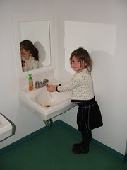
This last photo shows a bathroom sink that has been scaled to meet the needs of the target customer: 3, 4, 5 and 6 year olds. Again, not fancy, but immensely functional. The scale acknowledges that the most important people in this building [a school] matter immensely. It also empowers these youngsters to take responsibility for handwashing.


Given these ideas, how might you create a facility that meets the needs of your most important customers? After all, What Do Women Want? Thoughtful Solutions.

Some of today's Bathroom Blogfest '06 postings include:
+ Stephanie Weaver at Experienceology has posted A Star Bathroom Extends Your Brand
+ Maria Palma at Customers Are Always has posted Restrooms In Tijuana's Night Clubs

Technorati Tags:
Del.icio.us Tags:

Friday, November 03, 2006

The Benefits of Macy-izing... Bathrooms!

To date, I've touched on Federated twice: in Exit The Grandes Dames of Retail. Enter? and, earlier this Bathroom Blogfest week, in Bloomingdale's Bathroom Makeover. In neither case did I consider the benefits that our Wear-Dated rep. in Pittsburgh shares here!

Angie says: What I have found to be quite interesting in the Pittsburgh area is all due to the acquisition of the May company stores (Kaufmanns) by Federated (Macys). Being an avid Kaufmanns shopper, as any respectable Pittsburgher would be, the one thing that irked me tremendously were the bathrooms.

In each and every Kaufmanns store, the bathrooms were in serious need of updates and repairs.... Faucets -if they worked- didn't produce both hot and cold running water. Hand dryers at best offered some "heavy breathing" - totally ineffective for drying hands. Locks didn't work. Worse yet, toilet paper dispensers that "attacked" you as you were trying to use them [i.e., covers fell off!].

The bathrooms were messy: paper on the floor, water puddles on the counter, and no paper towels [and often no TP]. There's nothing worse than running out! What made it worse was looking at the cleaning log on the back of the door. Some mystery person would have initialed the hourly log at the beginning of the day for the whole day!!! If they did show up on an hourly basis, they might have inspected, but certainly NOT cleaned.

With the conversion to Macy's, other than changing the merchandise in the store to reflect the Macy's brands, I noticed some wonderful changes! They created sitting areas outside of the fitting rooms. Nice chairs, coffee tables, cool lighting......makes a big difference as opposed to that lunch room chair that was propped next to the teeny door opening to the fitting room!

And, most dramatically, they are closing down the nasty existing ladies rooms, one by one, and doing a complete renovation.... with updated fixtures and lighting, new floors, new sitting areas with nice chairs for those moms with babies, and clean diaper changing areas.

Still no paper towels as far as I can see, but at least the hot air dryers are hot and forceful! On that note, have you experienced the new super turbo hand dryers? [Sandra, isn't that the same hand dryer you refer to in What About Electric Hand Dryers?] They are wonderful! The G force of the air really pulls your skin away from the bone, but it dries your hands in a few seconds!

Good job, Macy's!

Off to Upcoming NYC Event: 11/3/06. More on the Bathroom Blogfest later!

Technorati Tags: ,
Del.icio.us Tags: ,

Thursday, November 02, 2006

What Do Women Want? Thoughtful Solutions!

I love the title of the 10/29/2006 New York Times article that has created such a buzz in the past week. [See Andrea Learned's Well Deserved Coverage for the Women's Market Opportunity and Michele Miller's Wonderbytes to name 2.] I even saw a comment that this has been the most emailed article in the history of the New York Times [just can't remember where :( ].

The article is What Do Women Want? Just Ask. Money Talks, And They're Buying by Mickey Meece. It refers to Joanne Thomas Yaccato - from The Thomas Yaccato Group and author of The 80% Minority - whom I heard speak at the 2005 M2W Conference in Chicago. And, yes, she is responsible for the very popular Yaccato 2 house model. [By the way, you can also access the NYC times article at this link on her site.] I bet its bathrooms are fabulous!

The article offers a lot of data about women's increasing purchasing power in the marketplace, with wonderful examples from Canada [Shane Homes] and the U.S. [Home Depot, Lowe's, Sears, Best Buy, Kimpton Hotels and Restaurants, MassMutual, Crave Party, BeJane.com, and AskPatty.com] illustrating that some companies are paying attention and LISTENING to its women consumers.

The article refers to Niki Leondakis, chief operating officer of Kimpton Hotels and Restaurants and explains that "some hotels overlook female guests by not emphasizing their personal security — or by offering an abundance of poorly designed rooms. For example, what 5-foot-4 woman has not had to jump up to see herself in hotel mirrors that do not provide full-length views? And why, in so many bathrooms, can makeup supplies fall so easily into the toilet?

Kimpton says 48 percent of its guests are women — compared with a lodging industry norm of 42 percent — and it addresses their needs with rooms that offer more lighting and closet space, better mirrors, bathroom shelves, hand-held steamers and items like razors and toothpaste. There are also in-room wellness programs featuring yoga, Pilates and meditation. And don’t forget in-room safes. “We like to travel with jewelry and we don’t want to wait in line at the front desk,” Ms. Leondakis said.
"

Bravo, Kimpton!

I came across this article by Melissa Clark from 1997 titled A Ladies' Room Lament which discusses "over-designed" public bathrooms, as well as more practical ones. She writes "a bathroom need not be large to be lovely." But it can be made "special" with unique materials, "by the choice of hardware, and by having adequate mirrors and a space to place a handbag or even change a baby." Then there is the lighting, which, Mah - a restaurant designer from The Rockwell Group - insists, "should be as important in the bathroom as it is in the dining room."" Wow, how thoughtful! She includes a list of 8 restaurants in NYC with some of the "nicest water closets" you'll ever experience [Vong is indeed lovely!]

Consider, then, the benefits of asking your women consumers for their opinions. They will be more than happy to help you develop thoughtful solutions IF YOU LISTEN!

[Talking about thoughtful solutions, read Learned's post on How Women Buy Toilets: They Sit On Them.]

The latest postings today from the Bathroom Blogfest '06 participants include:
+ Susan Abbott at Customer Experience Crossroads has posted Temporary Bathrooms: The Blogfest Continues
+ Reshma Anand at What I Do For A Living has posted Bathroom Blogfest: When signs dont work...its time to ask WHY
+ Linda Tischler at Fast Company's blog FC Now has posted The Upside of Long Restroom Lines.
+ Stephanie Weaver at Experienceology has posted Stall of Shame

And, some other related postings:
+ Bill Kinnon added to the discussion with And Now... A Bathroom Break.
+ Dee McCrorey at the Corporate Entrepreneur just posted Bathroom Blogfest: Ladies Loos are about Service, Too.

Technorati Tags: ,
Del.icio.us Tags: ,

Wednesday, November 01, 2006

Bathrooms That Floor!

It's time to consider the Bathroom Blogfest from the flooring store perspective. This is the real deal from dedicated professionals within the industry!

In case we haven't yet firmly established that women's expectations of and appreciation for good public bathroom experiences are HIGH, consider these reports from our Wear-Dated reps.:

Dana shares the following: "I have a chain here in St. Louis, where the stores are, for the most part, so dirty, cluttered and outdated, I haven't even gone into the bathroom. I don't know about you, but I can tell by the store appearance if I even want to use the bathroom." And, if she were in consumer mode, she would probably not want to shop there either!

Dana continues her report: I stopped at Advance Carpet One in St. Peters. As I walked toward the restroom, I immediately saw the male/female restroom sign. My first impression was "oooooh....the boys use this, too!" I opened the door and what a surprise! Since I have now been in the flooring industry for ten months, the first place my eyes went to was the floor. It was very clean with a beautiful rug runner.....and you could tell it had just been swept/vacuumed. Then I noticed the sink and how clean it was......and a box of tissue! The toilet said "don't be afraid to have a seat," and the room also smelled very nice.

When I left the restroom, I told Larry Crouch what a nice facility they had and how it was in the minority for any retail showroom. I also told him that as a female, it really says a lot about their concern for the customer. He then showed me the refrigerator and how it was totally full of water, soda, diet soda, etc., because if women/men are taking the time to shop his store he wants them to have a beverage and relax while they shop. He then told me that everyday he walked the showroom first thing in the morning and sprayed a room freshener because he knows the "ladies" really appreciate that. Being that I am still in consumer mode, I thought to myself, if he takes such good care of his "house," I would be very comfortable having him/installers inside my home knowing they would show the same concern and respect for for my dwelling as they do their own. WOW!!!

Robin was really skeptical about the Bathroom Blogfest. But, when she brought up the subject with her Mohawk mill rep. [a man], they both talked about the positive perceptions that flooring stores with nice bathrooms create! She adds: "As we were talking about it we both realized that at least subliminally, we really appreciate the stores where we feel most comfortable. The bathroom is a big reason for our comfort. "

She thought about the stores she visits most often [and the ones generating more volume in the marketplace] and realized that their bathrooms all have beautiful tiled floors and walls, fancy pedestal sinks, flowers, candles... Robin's favorite is Touchdown Carpet in Marlboro, MA. It sure sounds like success in the marketplace is closely linked to how positive a retail experience you can create throughout your store and including the bathroom!

Brenda mentioned a really neat bathroom in Flooring Fashions in O'Fallon, IL. In this store, the bathroom features heated ceramic tile, complete with a heated ceramic tile bench and grout that glows in the dark acting as a night light! Very cool. This store realizes that even the bathroom represents selling and display space.

Greer mentions that she and her mill rep [a woman] created a "top 10" list of dealer bathrooms and strategically planned their day to hit a top 10! They love dealers who have not only soap, but also lotion at the sink. [So much for thinking that soap was a given!]

I've saved the best for last because I am so impressed with this carpet store owner's focus on the consumer and the retail store experience. I spoke with Claudia Smith, owner of Aggieland Carpet One in College Station, TX. Claudia and her husband Ron run an amazing flooring operation in a truly beautiful store!

At first, Claudia said their bathroom wasn't anything special. I probed and realized that I had hit pay dirt!!! This is the third year in this location, and the bathroom is due for a makeover. Aggieland redoes its bathroom approximately EVERY YEAR! That's right! That's how seriously the bathrooms are taken!

Claudia explained that the bathroom is the one space in the store most like a home environment. It is where a whole design concept can be carried out from floor to ceiling, to countertop, to fixtures, to the walls. It's the best place to display the quality of installation work and the range of products that Aggieland offers. It is part of the overall retail environment, a part of the shopping experience, with the added benefit of being more home-like.

Pleasant smells are critical, particularly in the bathroom. In the winter, Claudia likes to use spices, and in the summer, citrus. The bathroom, she says, sends a message not only to the consumer about the quality and workmanship that Aggieland offers, but also to her employees that they are valued and play a critical role in delivering the best consumer experience possible. Thank you, Claudia and Ron, for being so committed to creating an amazing experience!

A woman's touch goes a long way! Many of the Wear-Dated reps. report that stores owned by women or dominantly staffed by women make a big effort to deliver store and bathroom experiences that are not only meticulously clean and functional, but also deliver nice touches and sometimes even fabulous attention! And consumers respond accordingly!

Now, for those of you who aren't able to easily refurbish or redo your bathrooms, don't despair! First, some words of wisdom from Dana: I visited another store with a dedicated ladies room. The sink was somewhat dated as was the tile, but.....it was clean and smelled great! Not only did it have a room air freshener (I don't know if it was a mist or solid), but there was also a can of air freshener. The sink had no standing water and was shiny and the toilets, although the seats were old, you could tell were clean. Overall, I was very comfortable using the restroom. Old bathrooms are like antiques, per my mother, as long as they are clean they can still be useful.

And, second, stayed tuned to the rest of the Bathroom Blogfest as you can be sure that we will be sharing tips on how to make the most out of what you have! Consider, too, asking our Wear-Dated reps. for their suggestions.

It's been a busy day! The latest Bathroom Blogfest ‘06 contributions are:

+ Susan Abbott at Customer Experience Crossroads has just posted Place and Process in the Ladies Room.
+ Reshma Anand at What I Do For A Living has posted Bathroom Blogfest : Would you put your money in your bathroom?
+ Jackie Huba at Church of the Customer has posted The Great Bathroom Blogfest.
+ Maria Palma at Customers Are Always posted Bathroom Blogfest Day 2 and Bathroom Blogfest: Shouldn't Employees Know to Wash Their Hands?.
+ Sandra Renshaw at Purple Wren posted What About Electric Hand Dryers? and Ladiesrooms Need Fresh Air and Update on Bathroom Blogfest '06. You, go, girl!
+ Stephanie Weaver at Experienceology posted Let's Not Forget the Mensroom. [Stephanie, I was sent the 2nd photo, too and I'm told that the photo is of a NY law firm loo! Makes the communal facilities from Ally McBeal look pretty tame.] Also, check out A Captive Audience.
+ Linda Tischler at Fast Company's blog FC Now posted Today's Good Citizen Award: Starbucks. Linda, absolutely! Starbucks is my office when I'm on the road, and I gratefully rely on their facilities [and their venti skim lattes].

Technorati Tags: , ,

Del.icio.us Tags: , ,

Related Posts Plugin for WordPress, Blogger...